Approach
Reinventing the NextGen SharpX Financial Report System using Design Thinking.
By establishing empathy with the user, designers are able to work towards outcomes that meet those needs more successfully.
My role · Visual Designer
I was one of the visual designers on a team of six. Once a track's UX designer finalised a layout, I took it to pixel level and kept every report visually consistent with the system.
- Screen visual designFine-tuned report screens across tracks: hierarchy, colour, charts and KPI tiles.
- Design systemColour palette, typography, clickable components, tables, charts and spacing guidelines.
- HandoverThe design guideline document the SAC developers built from.
- Phase 2Responsive layouts, illustrated landing pages and the standard component repository.
User centred design
Empathy with the people reading the reports shapes every decision.
Time efficient
As time goes on, the cost of making changes increases. Designing and testing prior to development saves time and money.
Agile + design thinking
Closely aligned principles that let us solve complex problems with creativity and empirical adaptation.
Gathering data
- Heineken financial reports
- User needs
- Business requirements
- Understanding SAC
Filtering data
- User journey
- Pain points
- Brief from all tracks
- Feature set
Start on design
- Wireframing
- Developer feasibility
- Working sessions
- Design system
Test and release
- Design guidelines
- Developer handover
- User acceptance testing
Discover
Understanding who reads the numbers.
Research objective: to understand the user needs, motivations and pain points with the existing system. Method: user interviews.
User groups
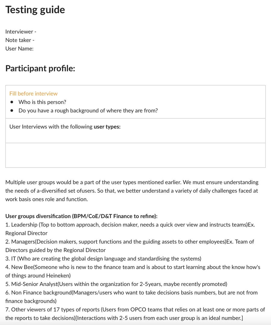
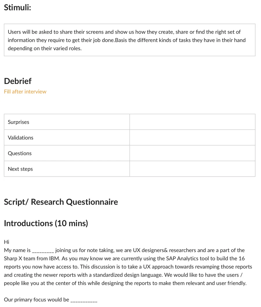
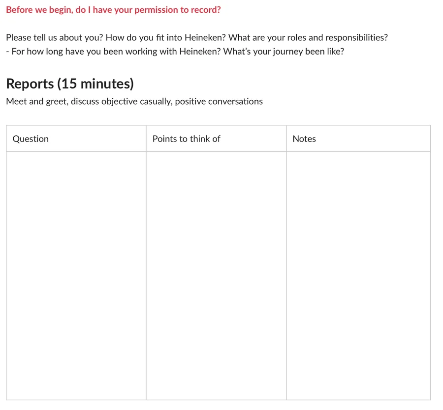
Research guide for user interviews
We created a research guide which helped us streamline the process of user interviews and execute in a structured and timely manner.
Analysis of findings
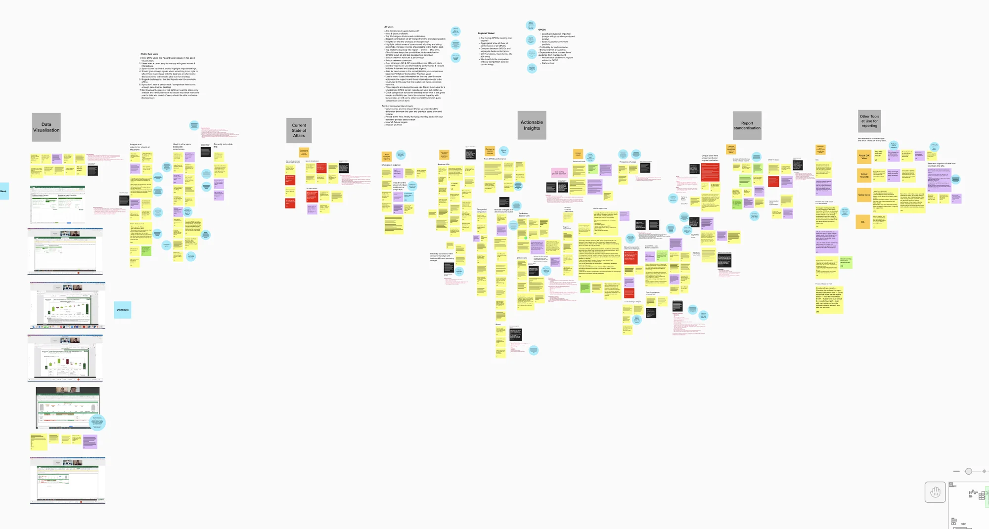
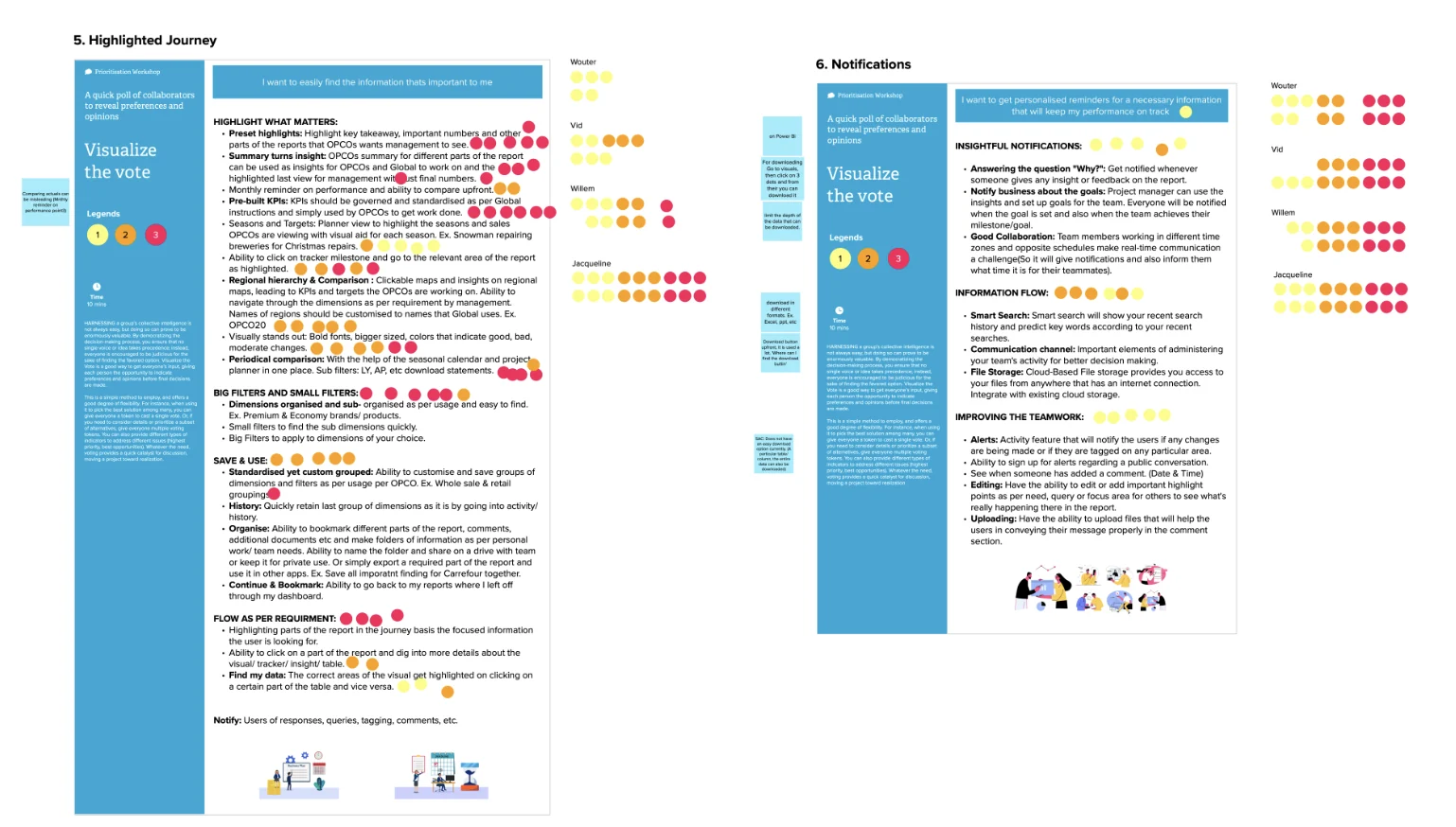
Findings from all the user interviews were compiled in one mural. Affinity mapping helped us understand the pain points, problem areas and user insights.
Define
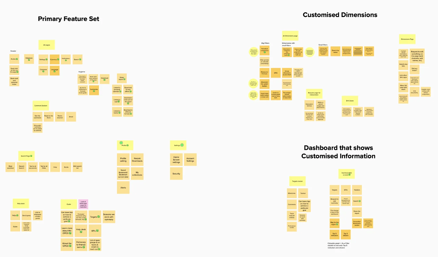
From hundreds of notes to a focused feature set.
Identifying problem areas
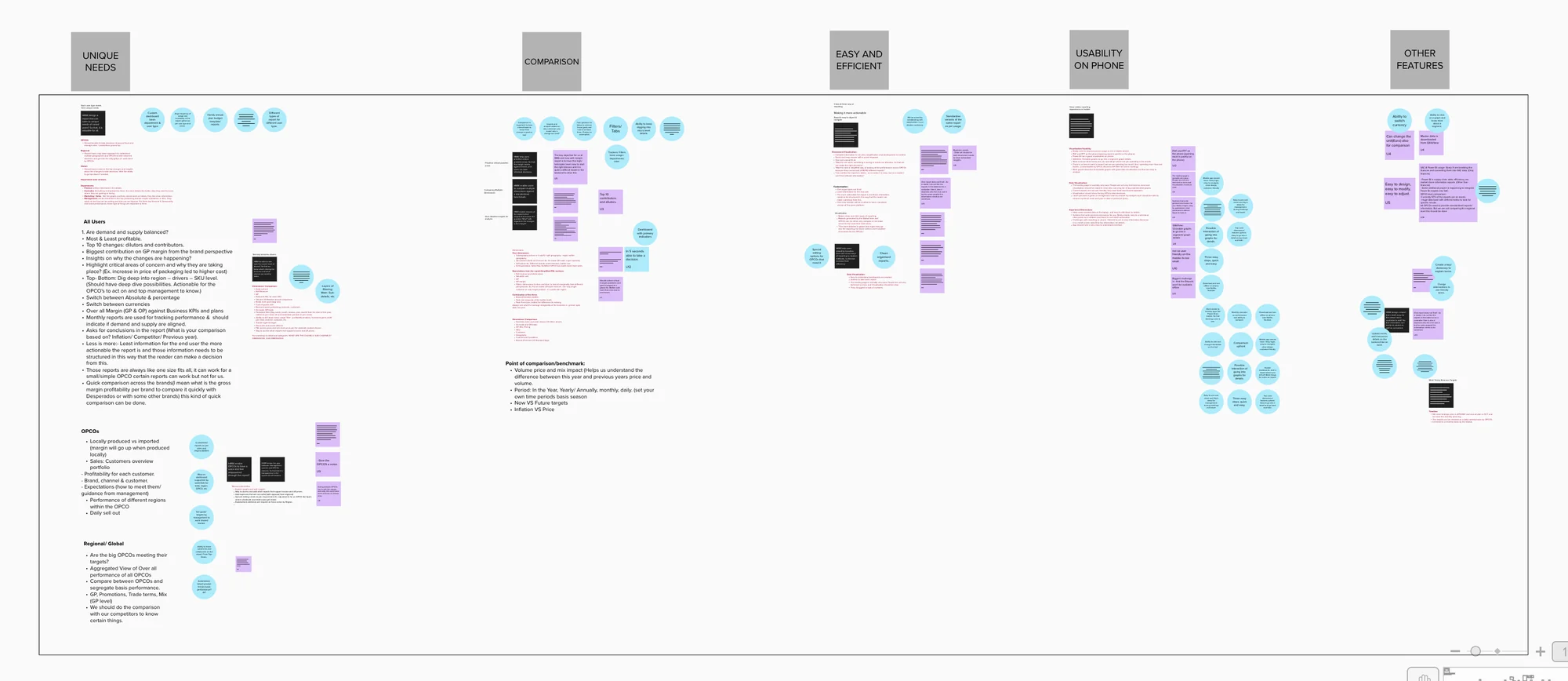
We categorised the data by theme and intersected everything important to the business and the users, so solution generation could focus on specific problems.
Exploring a visual design language
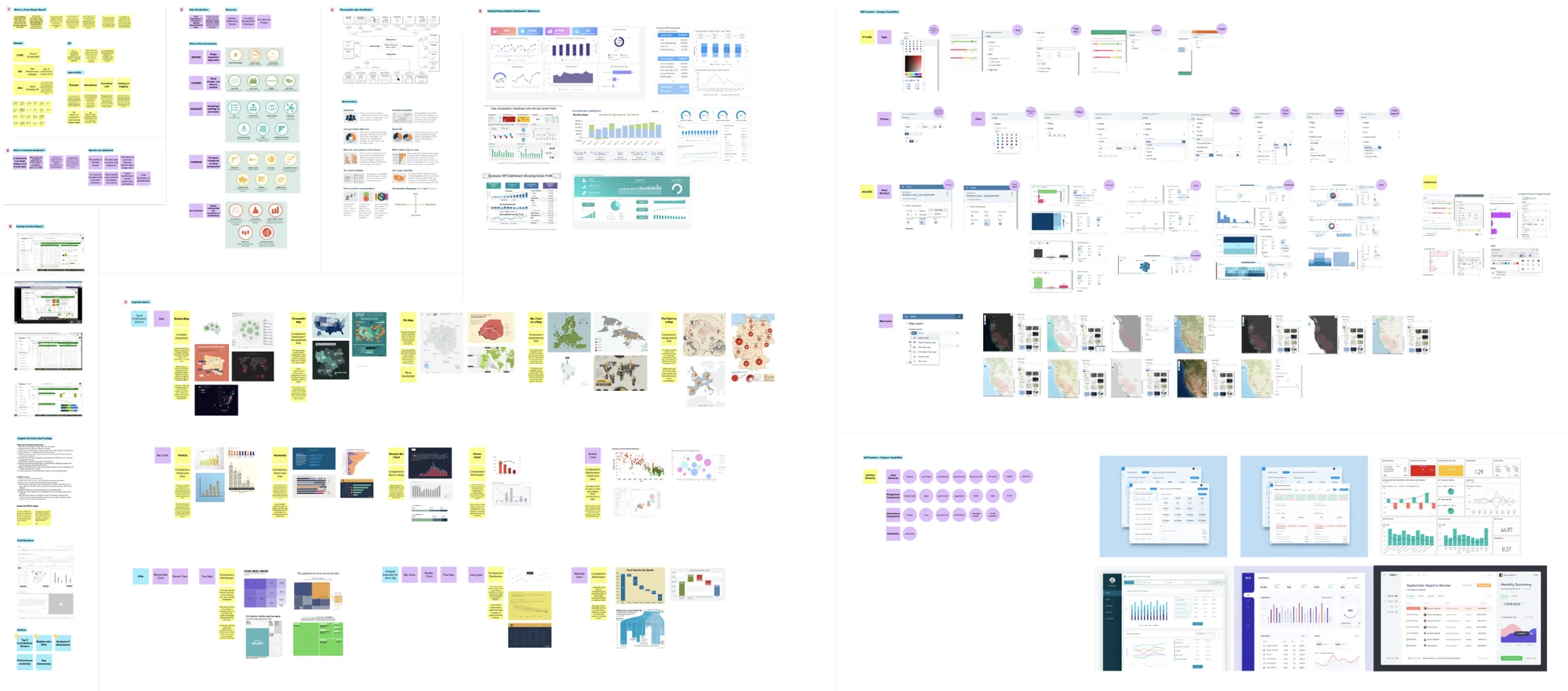
An inspiration board of graph types and Gross Margin UI research set the direction before the first wireframe.
Design
Nine tracks, one way of working.
Track-wise approach
A team of 6 (3 UX and 3 UI) across 9 report tracks. Each UX designer owned a track end to end.
- Gets the functional requirements from the track MR CoE.
- Wireframes are discussed with track members and SAC developers in working sessions.
- Daily stand-ups with the track to share changes and inputs.
- The track presents work in progress in its SteerCo.
- SteerCo feedback is worked in through sessions with the track and developers.
- The design team reviews together for usability and consistency across tracks.
- The UX designer finalises the layout and passes it to visual designers.
- Visual designers fine-tune the screen. This is where I came in.
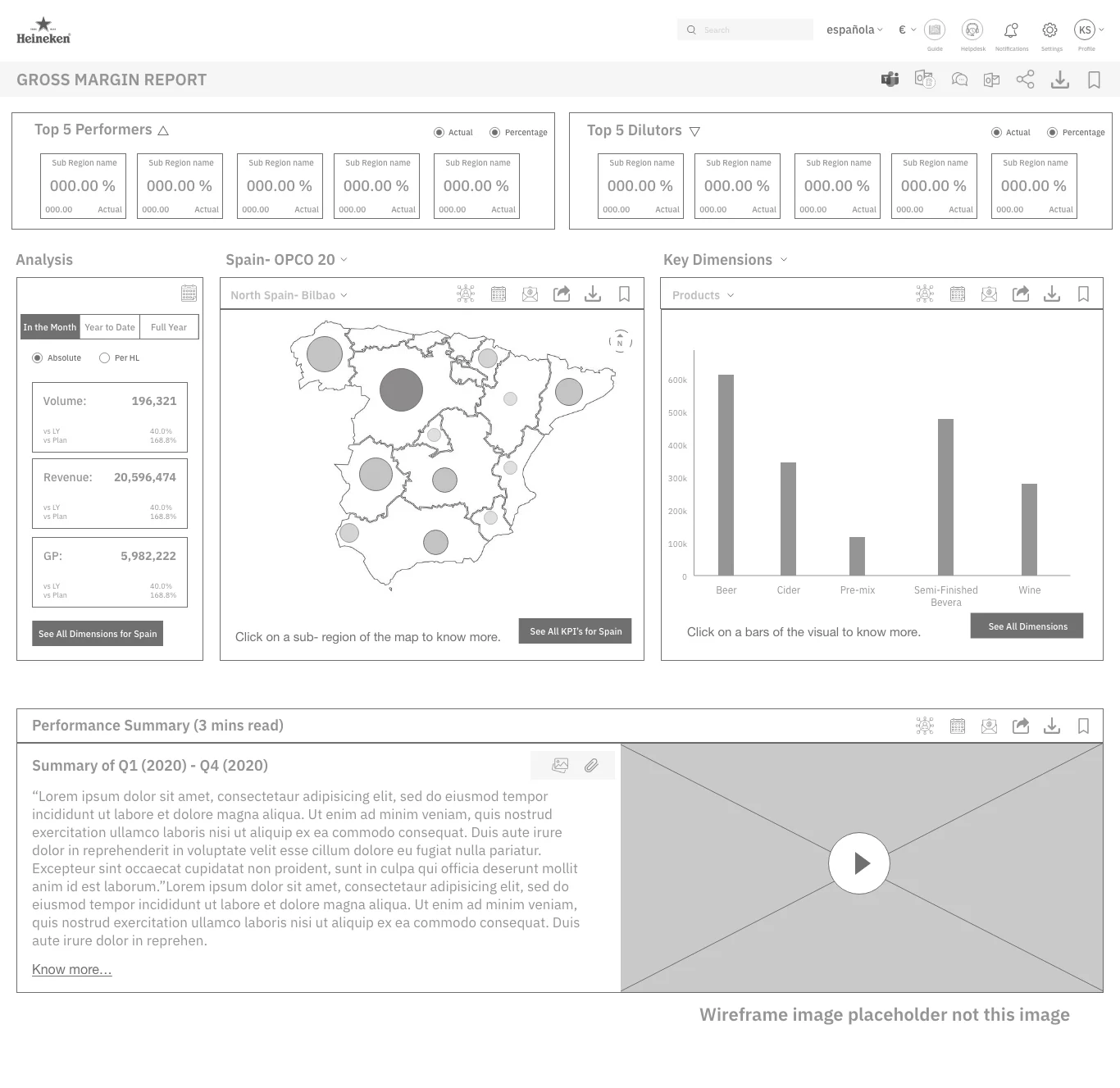
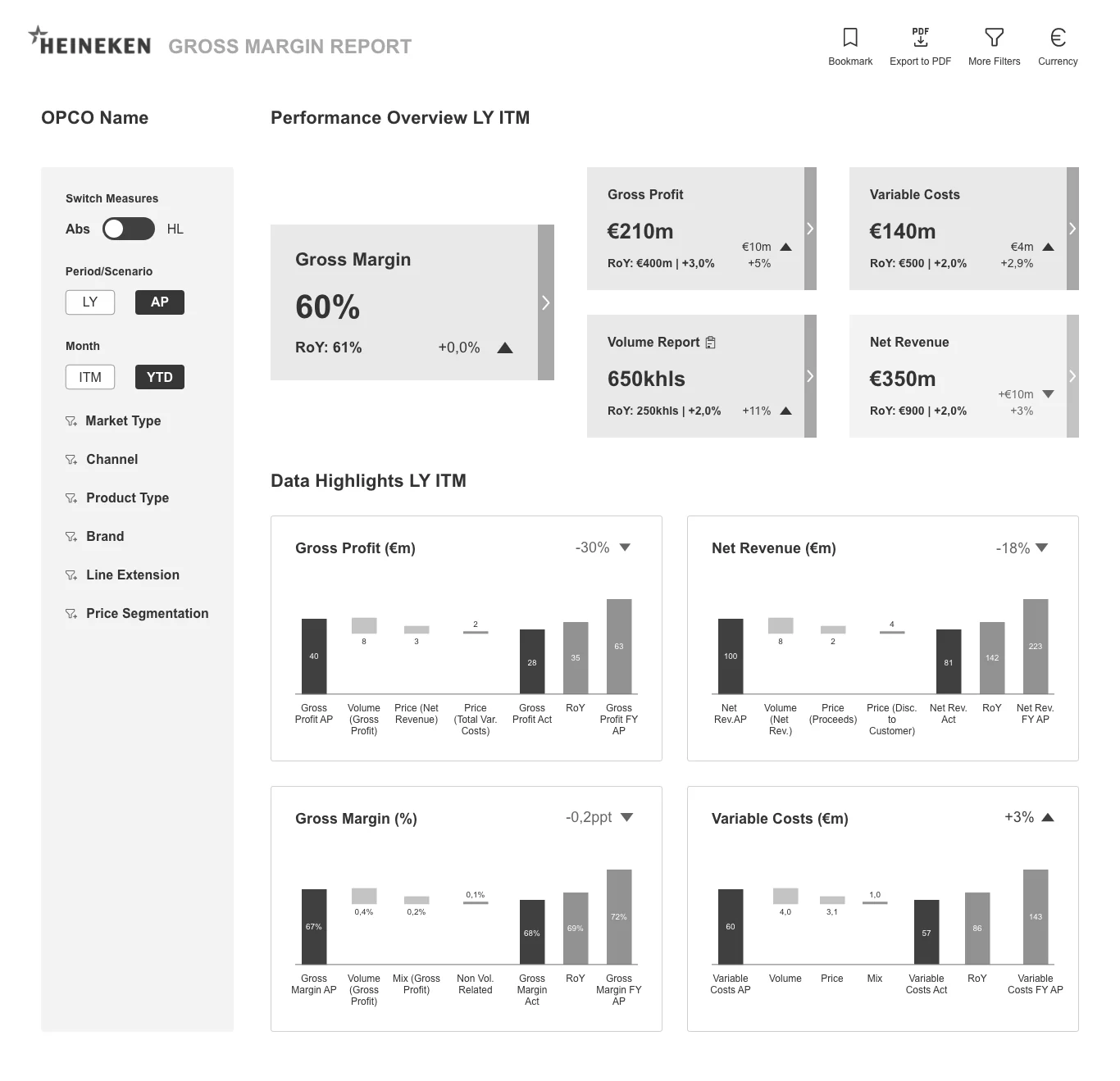
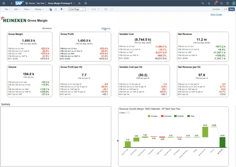
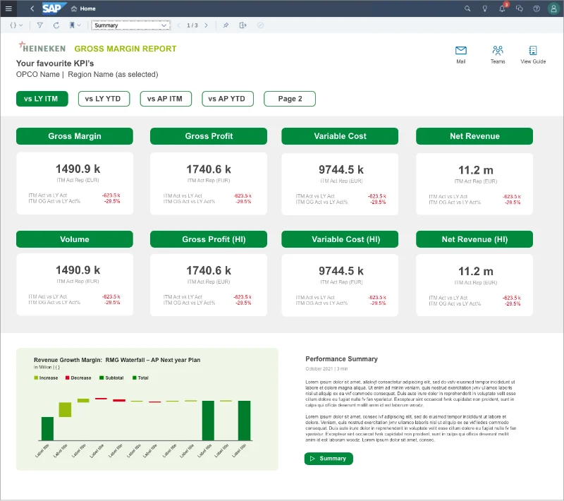
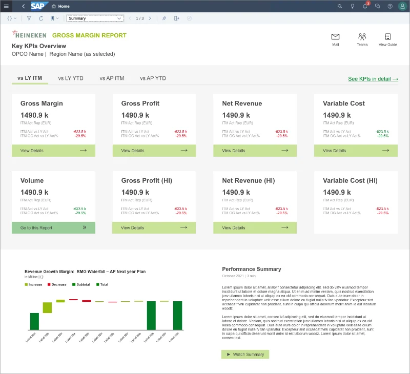
Evolution of screens, working with SAC limitations
How the Gross Margin report evolved over the design and delivery phase. Pick a stage, or let it play.
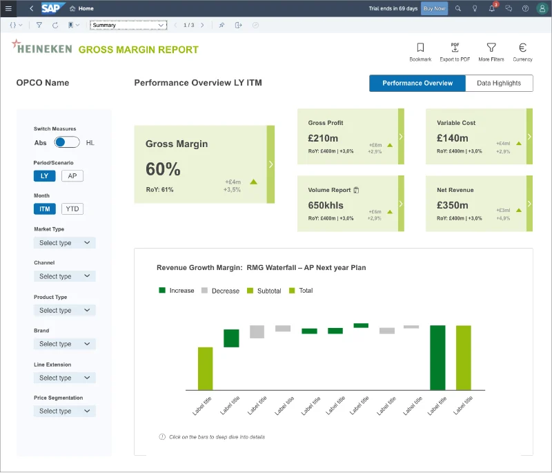
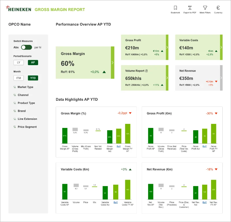
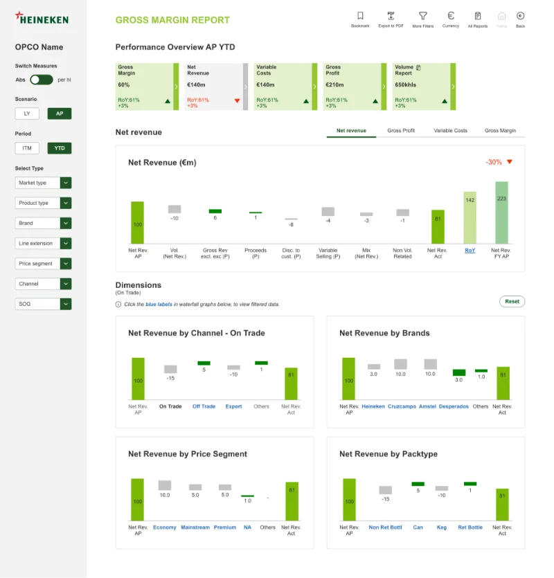
 Stage 01 / 07
Design system
A reporting language built on the Heineken brand.
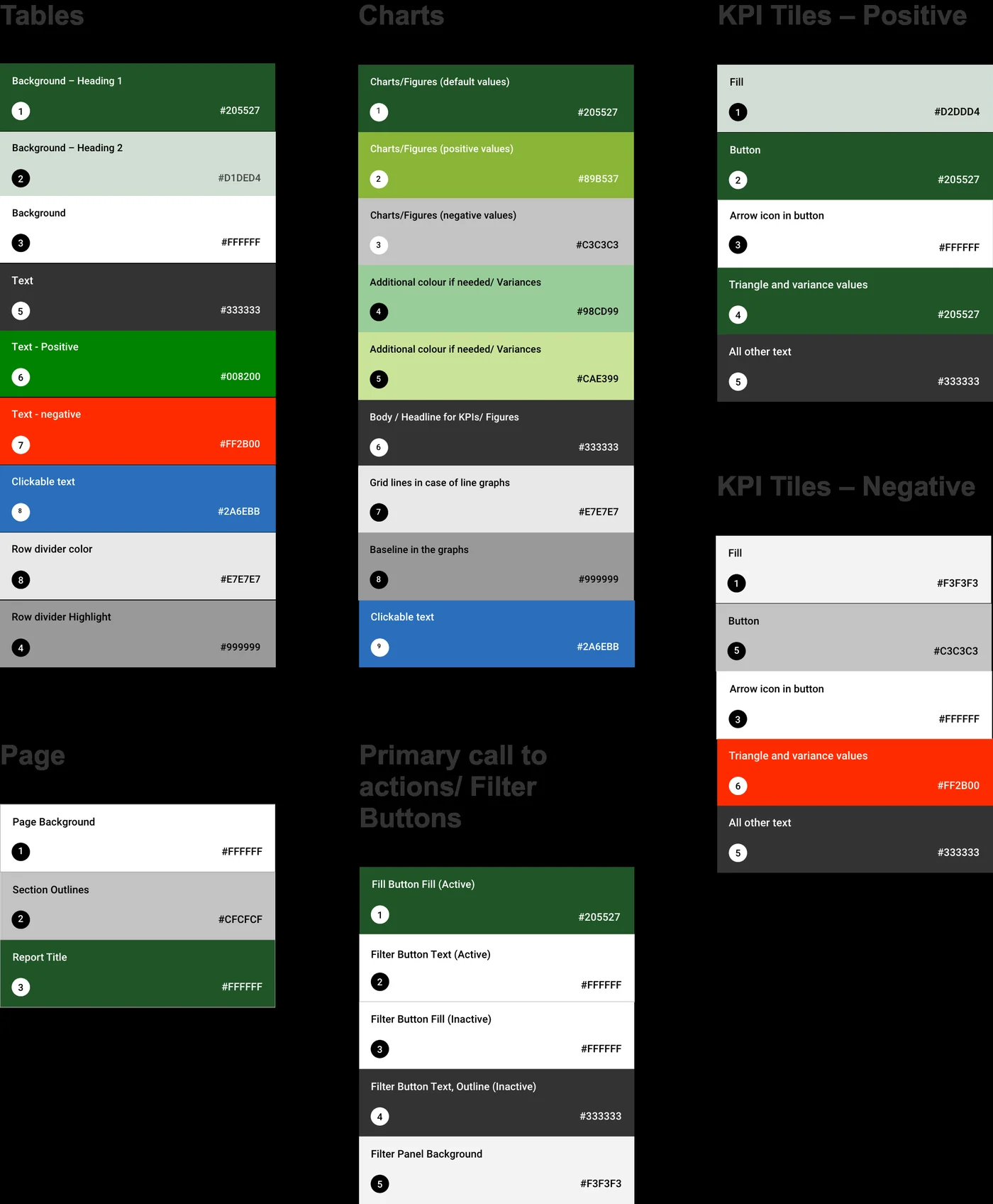
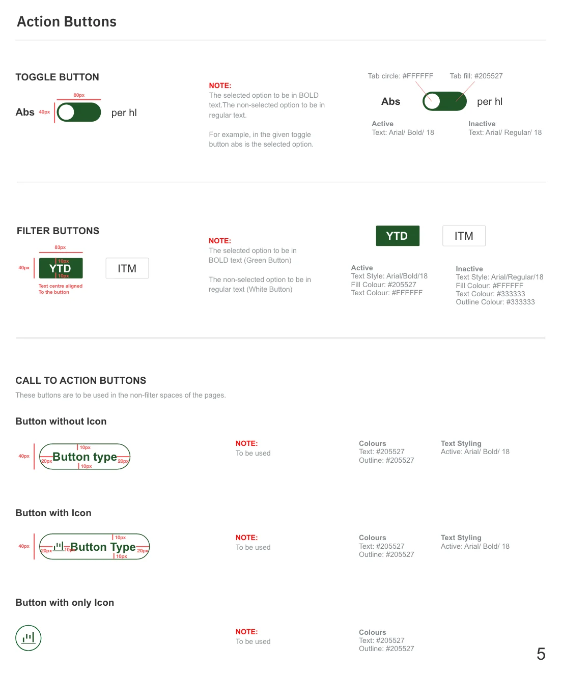
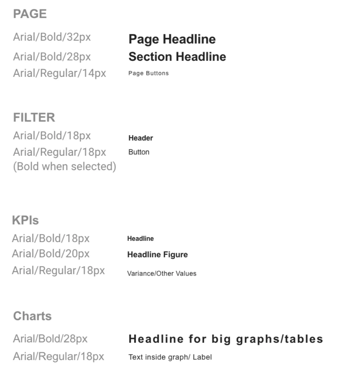
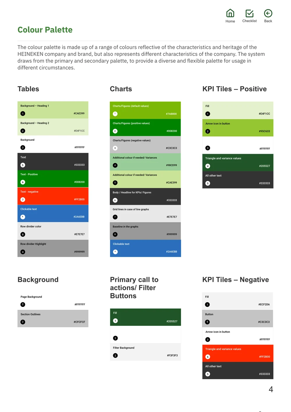
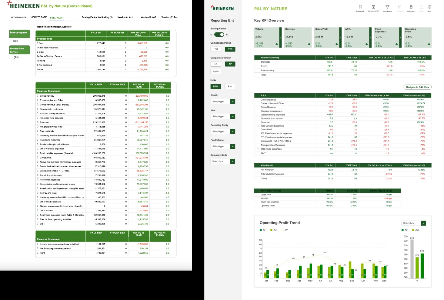
We defined a design language that incorporates Heineken's global brand identity, built a pattern library of common elements, standardised KPI tiles, graphs and tables, documented when to use each, and set spacing guidelines, bridging the gap from design to development.
One system, every report turned green
With the help of the design system, we converted all the layers across all reports to the corporate green palette efficiently. Drag to compare.
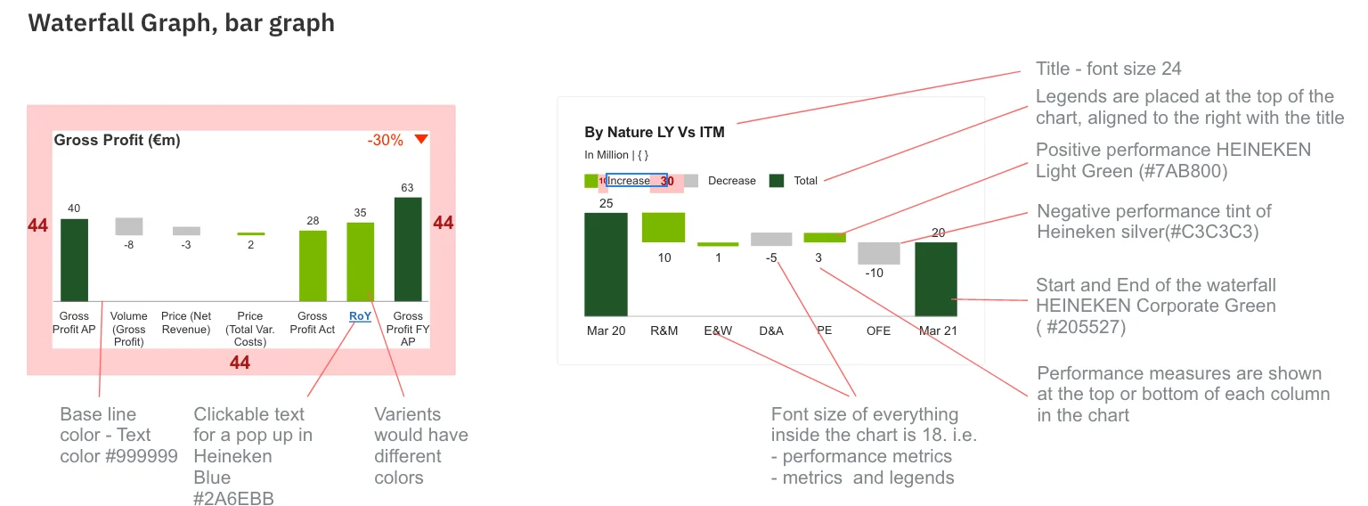
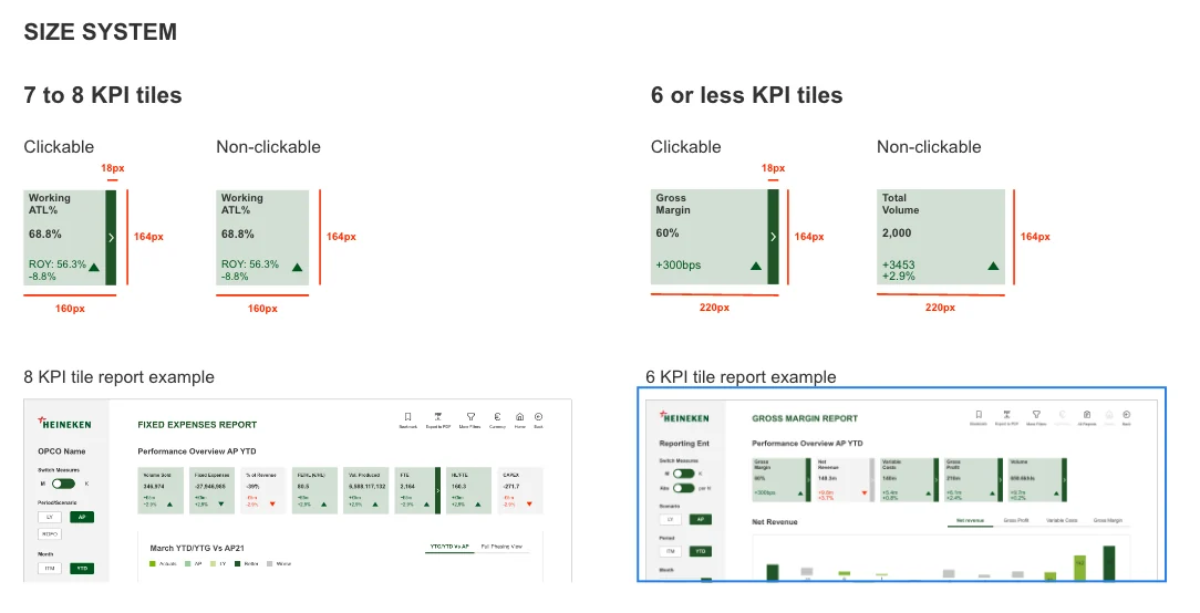
Tables, charts and KPI tiles
Standardised building blocks that every track reuses.
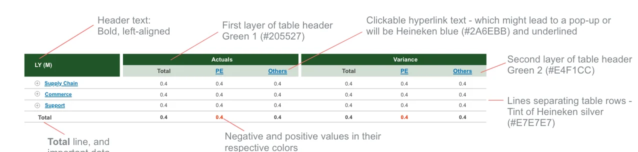
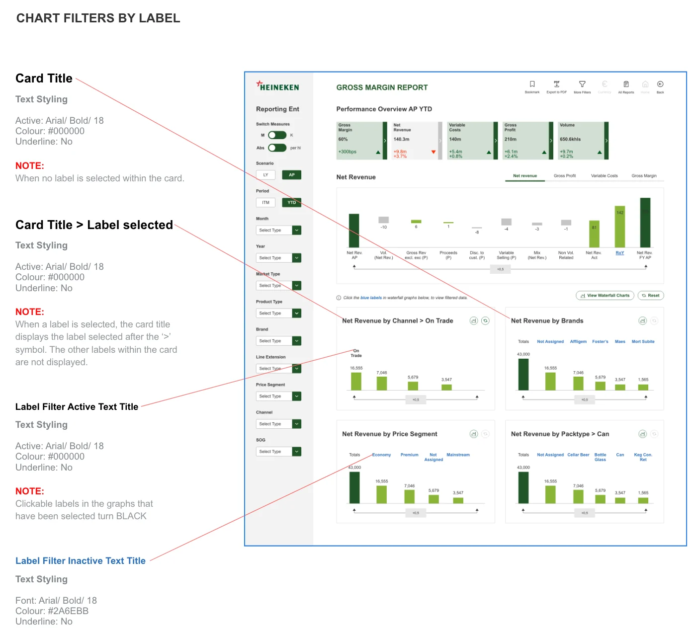
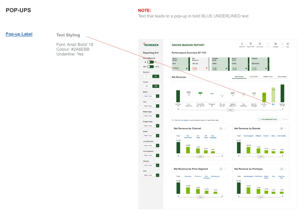
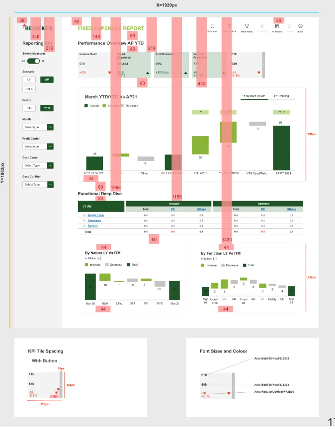
Text interactions and spacing
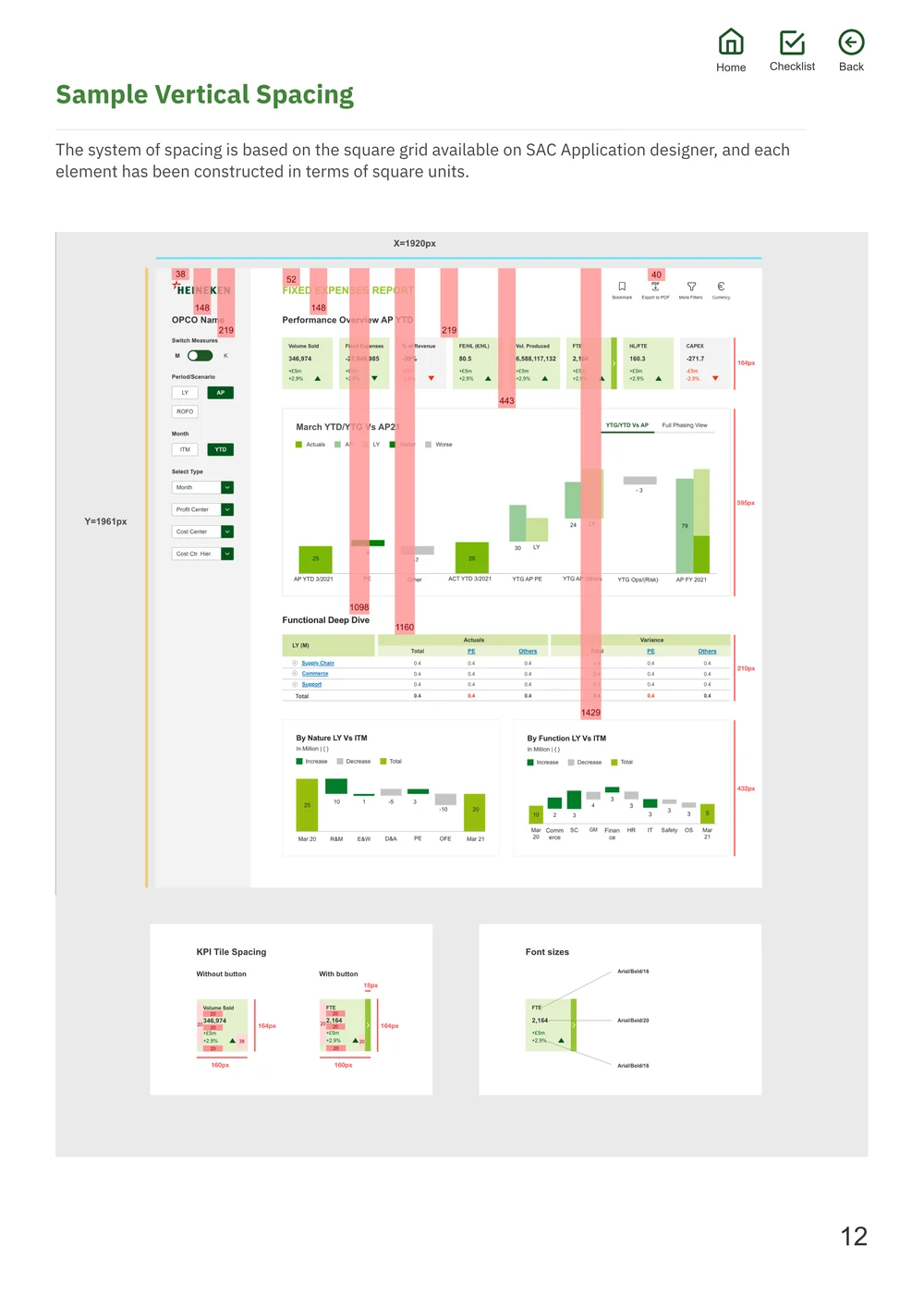
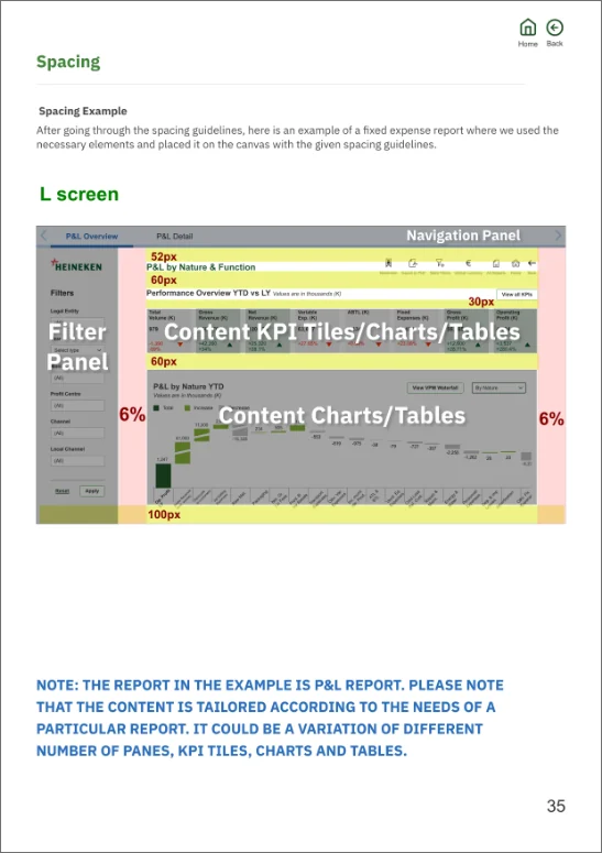
Clickable labels, pop-ups and a screen spacing guide for vertical, horizontal and alignment rules.
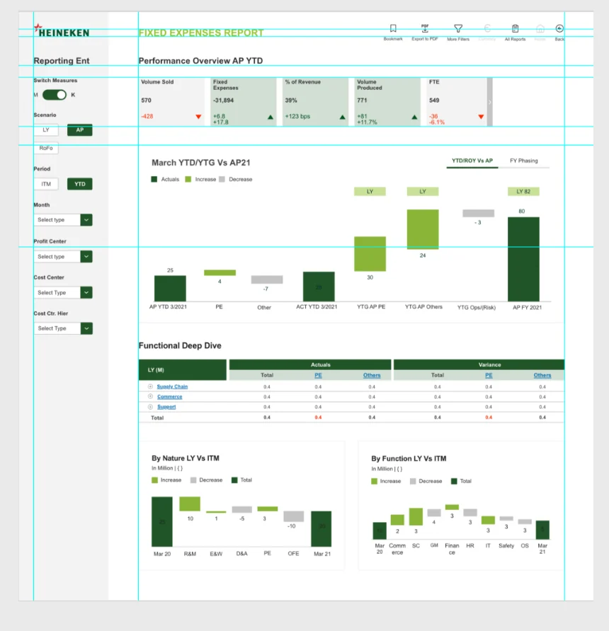
Final screens
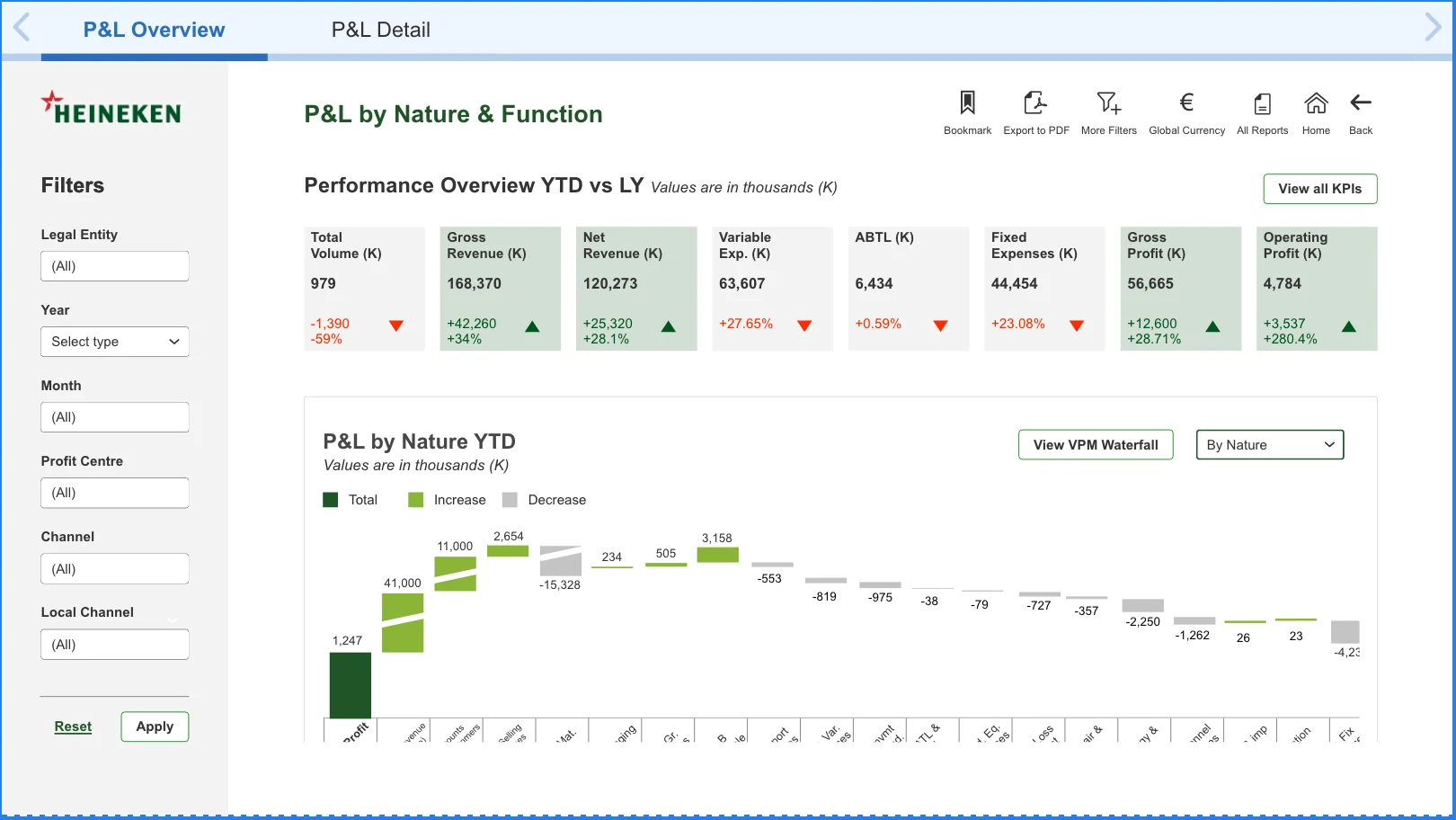
Performance at a glance, detail one click away.
The Gross Margin report. Tap a marker to see how each part works.
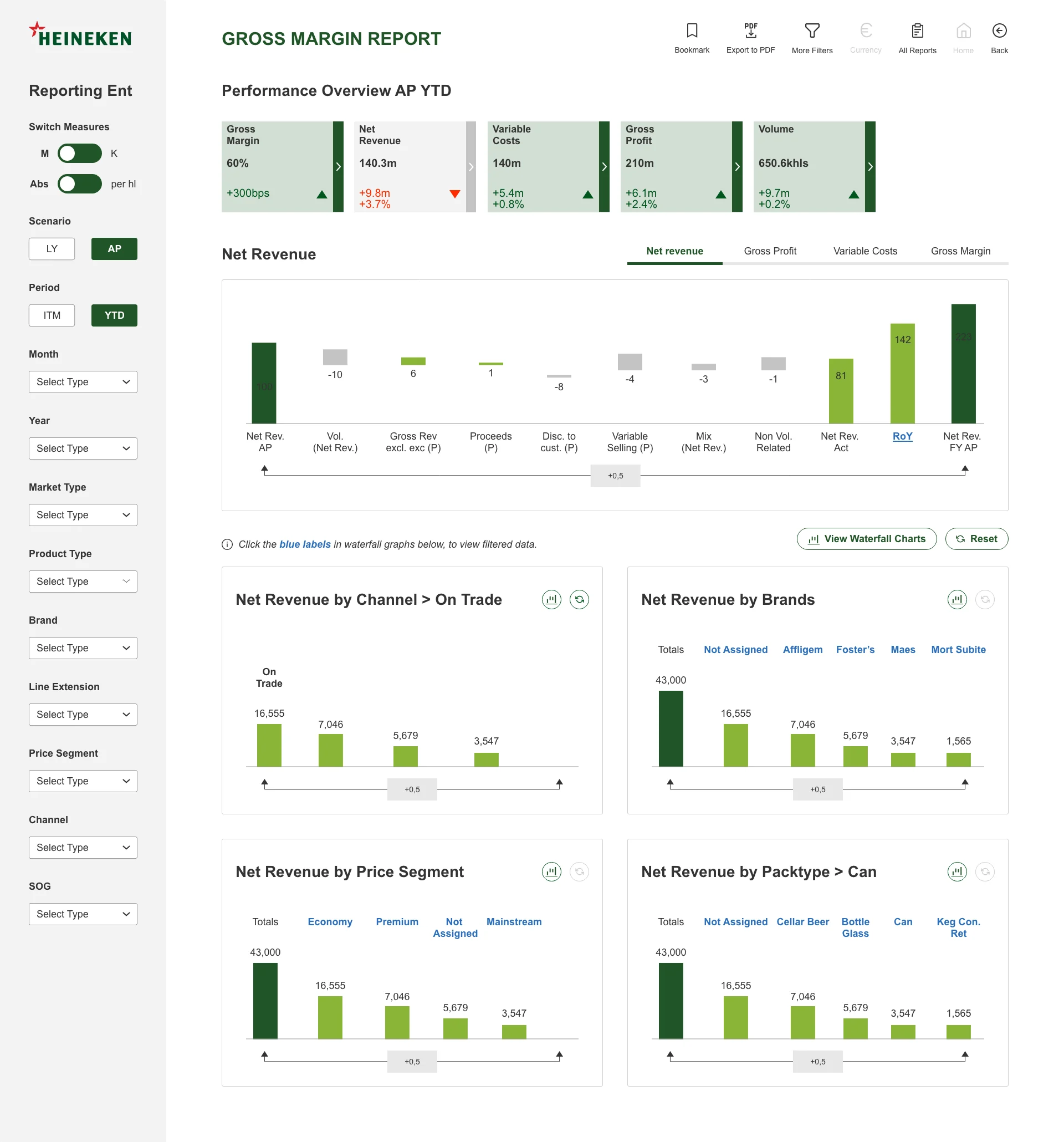
- 1KPI tiles
KPI performance at a glance. Colour denotes performance, and the vertical bar marks a clickable tile that opens an in-depth analysis page.
- 2Tabs
Further classify content and switch easily between views.
- 3Filter panel
Leaves room for customisation and filtering of data.
- 4Data visualisation
Graphs, waterfalls and charts with an intuitive use of colour: dark green totals, lime increases, grey decreases.
- 5Clickable text
Used across tables, KPIs and graphs to take the user to another page, improving their time efficiency.
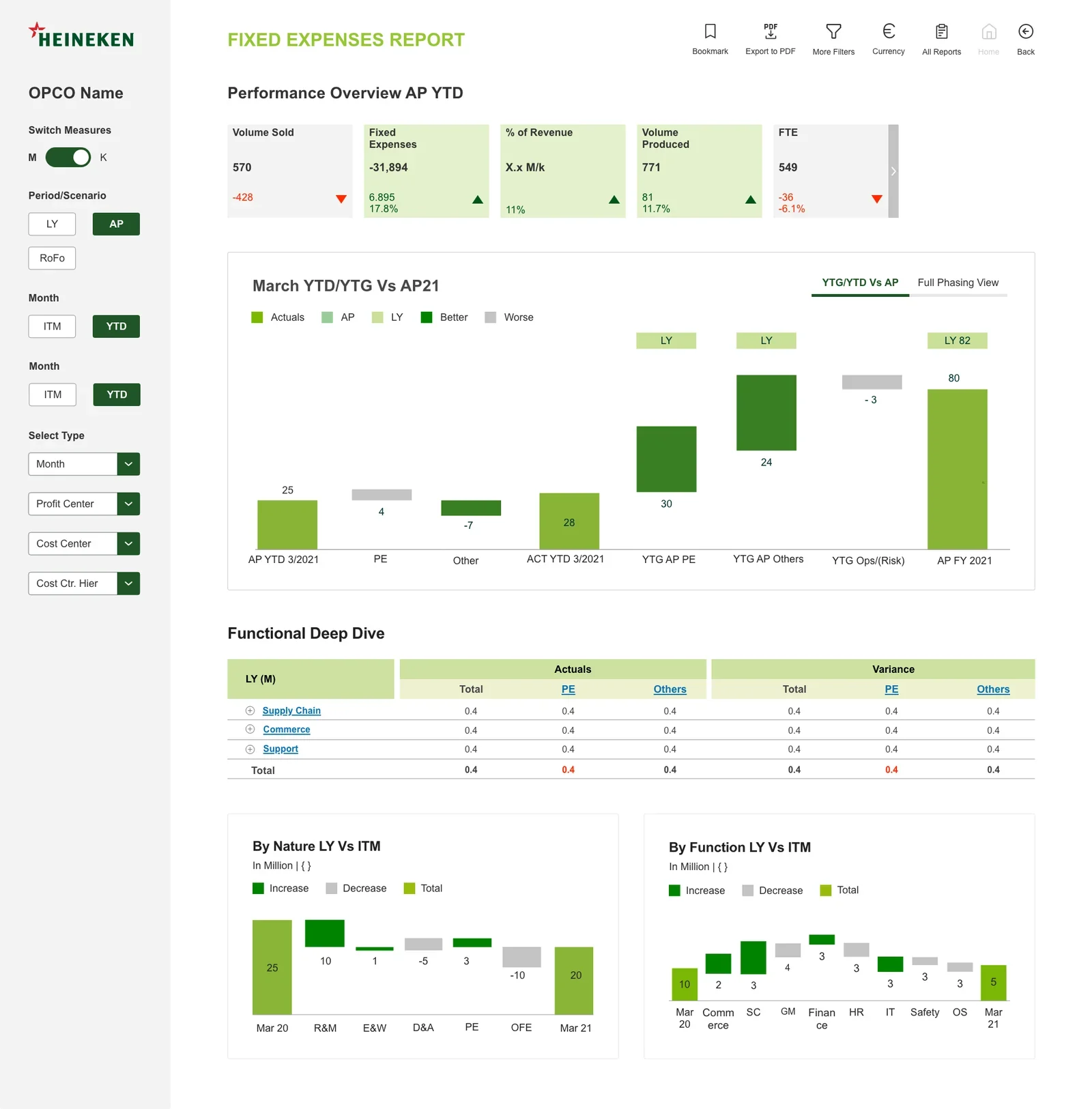
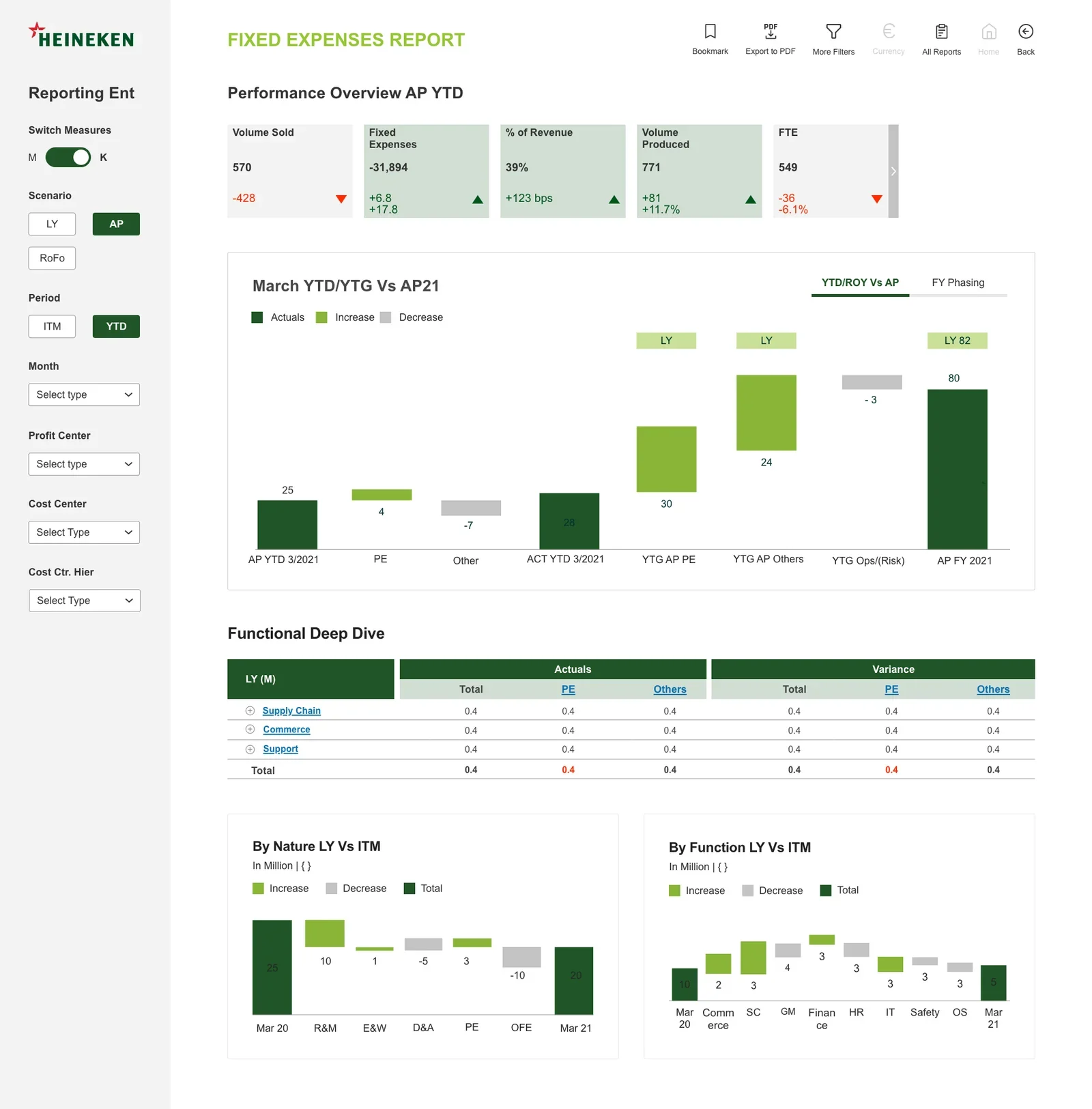
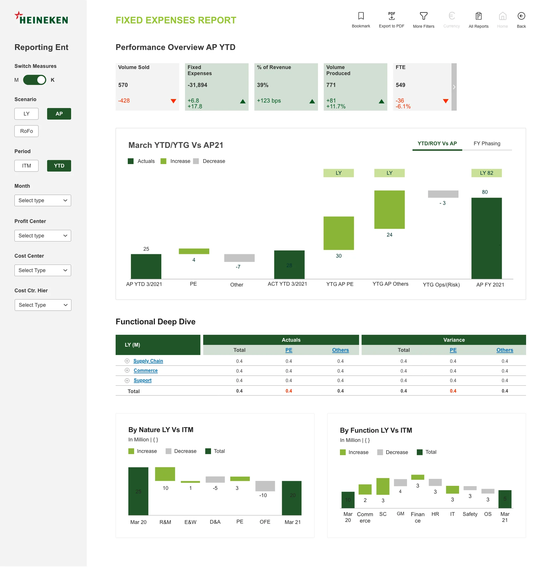
Fixed Expenses report
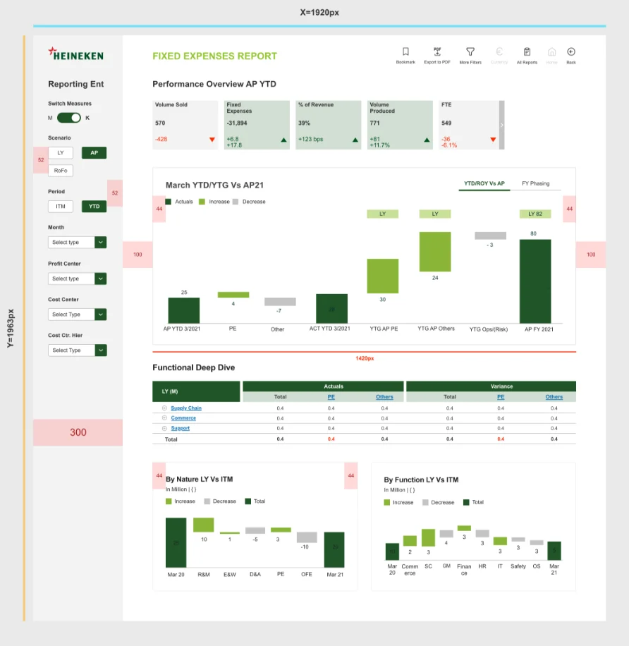
The same system applied to another track: identical tiles, filters and waterfall conventions.
Deliver
From Adobe XD to SAP Analytics Cloud.
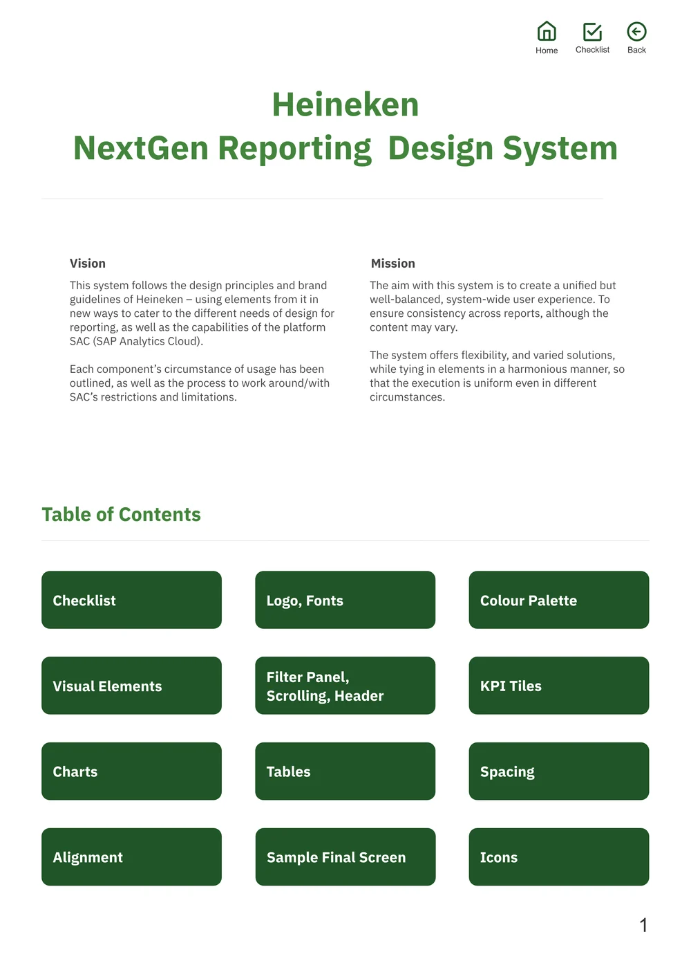
Design guideline
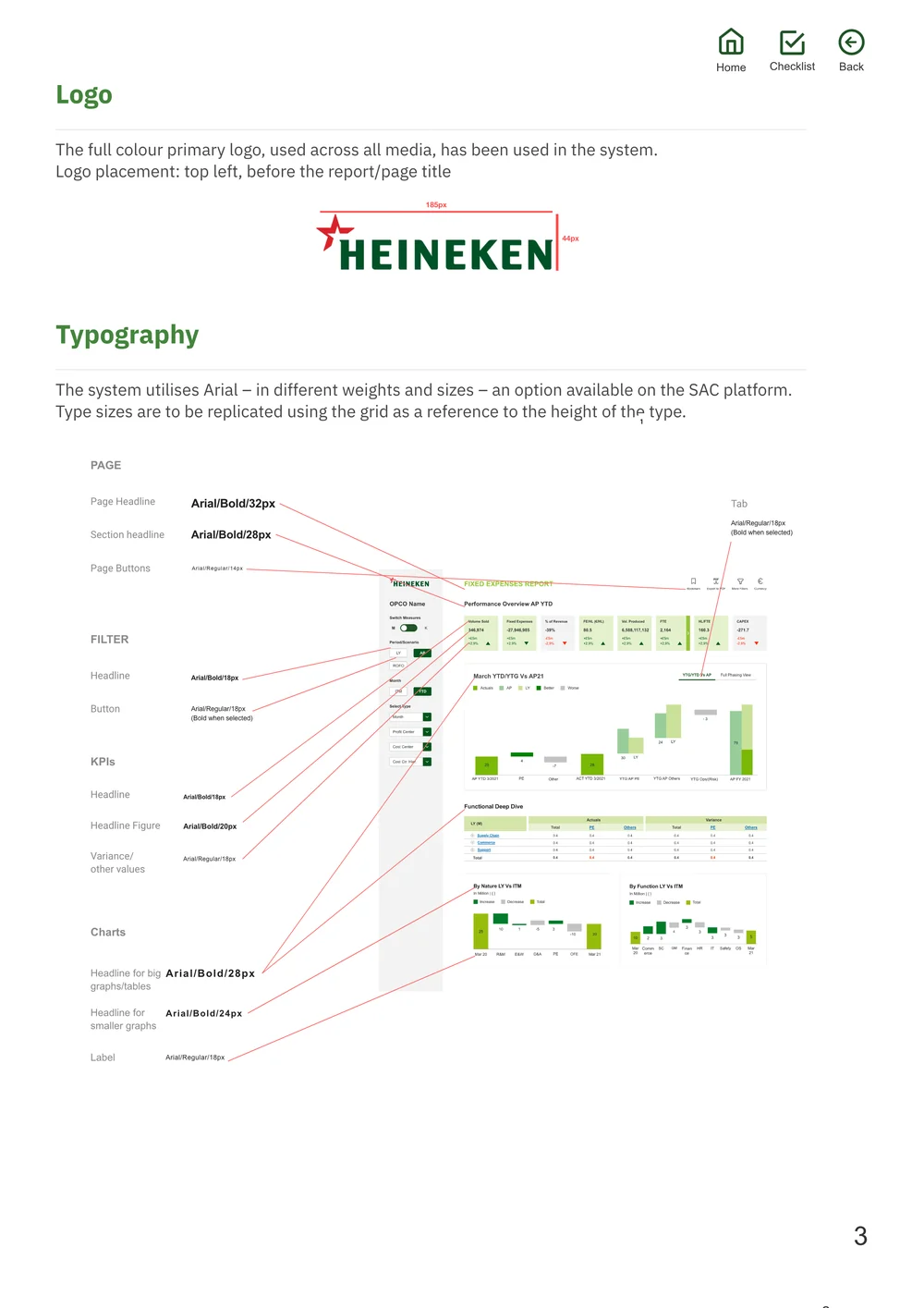
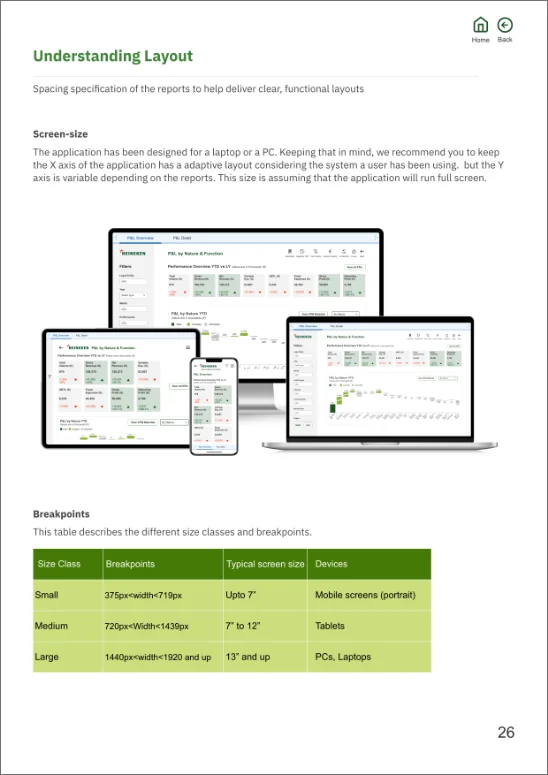
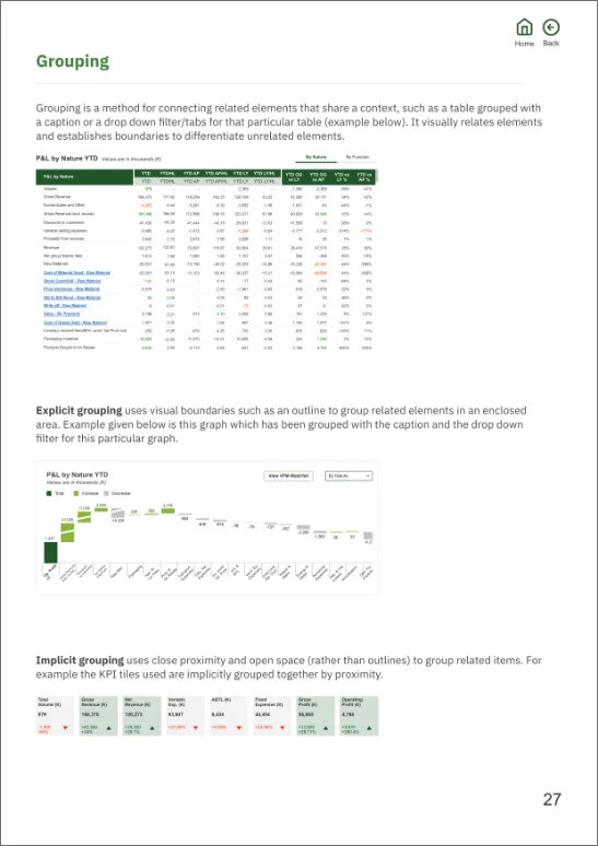
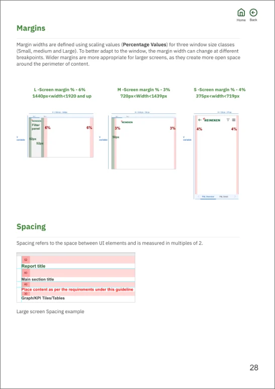
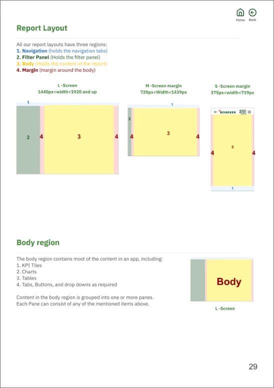
To ensure easy and seamless implementation on SAC, a document with every specification (typography, colour palette, spacing and more) was handed over to the developers.
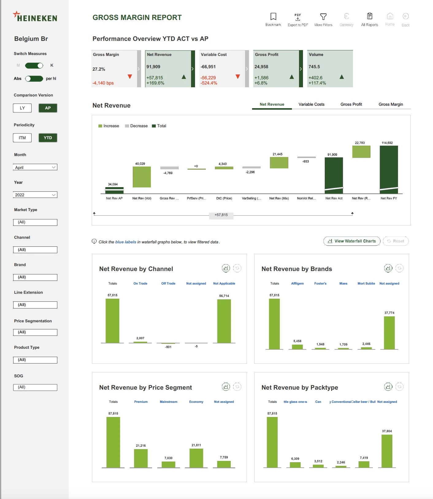
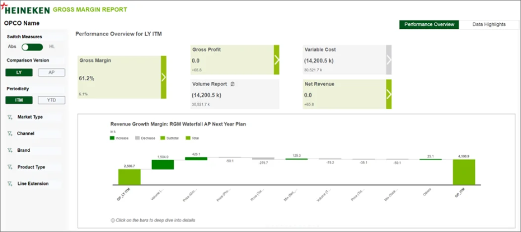
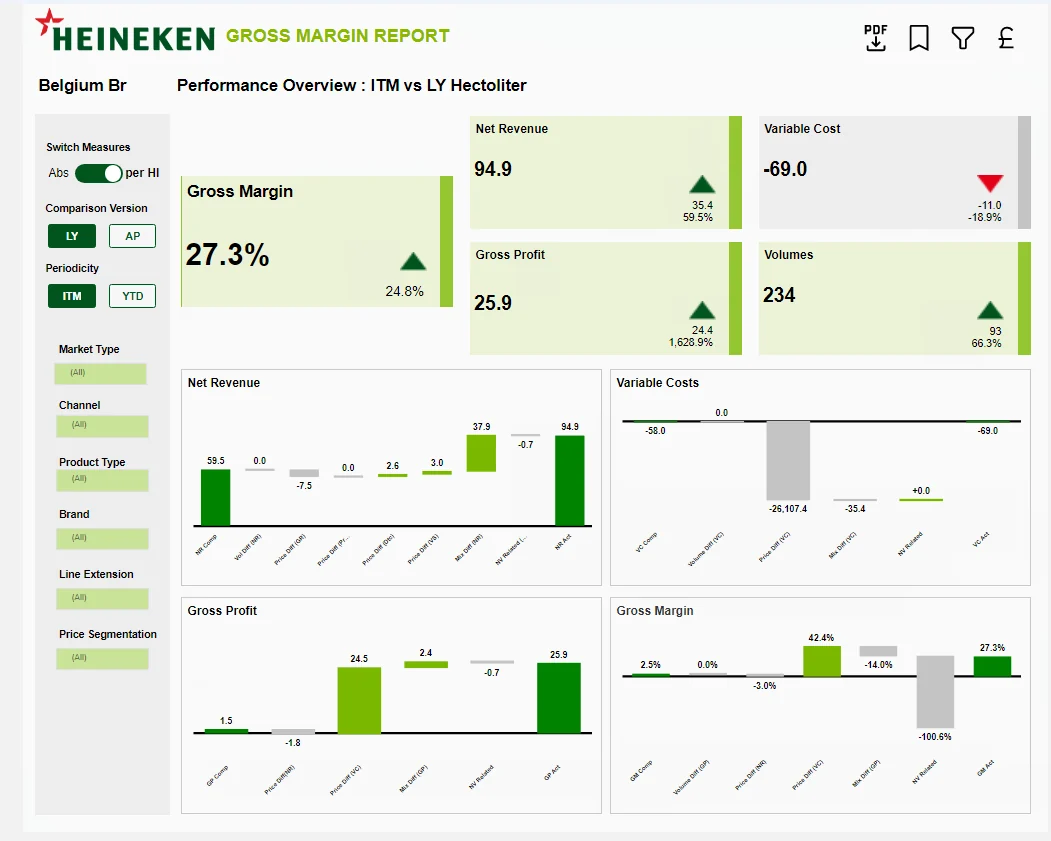
Evolution of screens on SAC
Three builds of the Gross Margin report, as developed in SAC.
Impact
Clearer reports, less cognitive load.
Improved visual hierarchy for the content
A design system that ensures consistency across all reports
More options for users to customise and process data
Room for further modifications in a much easier way
Expanded SAC possibilities through better representation and new components
Fewer scrolls and more concise reports
More intuitive to use
Less cognitive load on users
Phase 2 · Heineken Project Core
Responsive, illustrated, built as components.
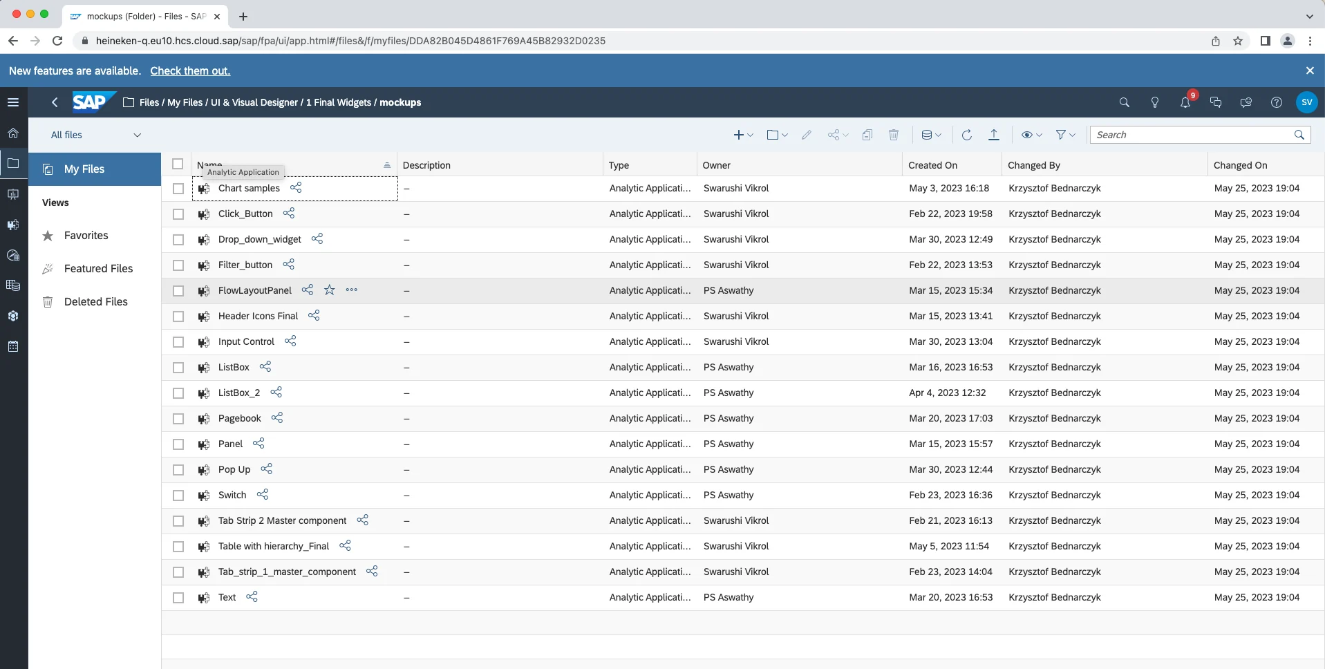
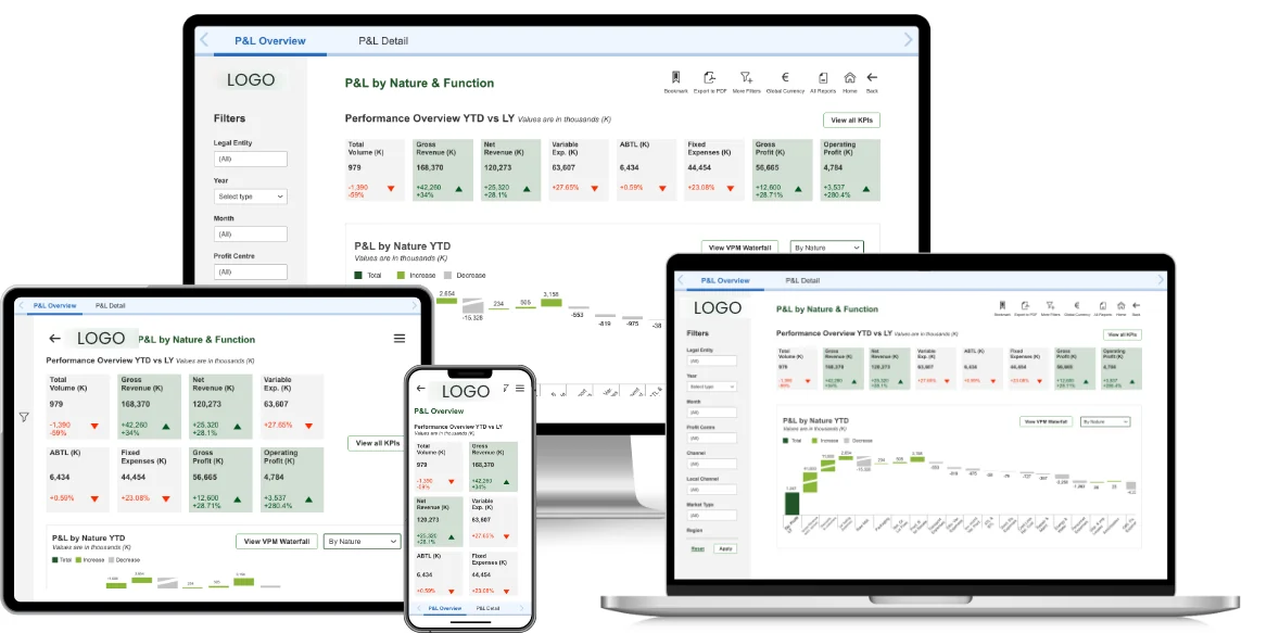
In the next phase we brought visual design and SAC analytics together: responsive designs, an evolved design system that uses all SAC capabilities, and a repository of standard components aligned with Heineken standards, including embedded CSS.
Responsive designs
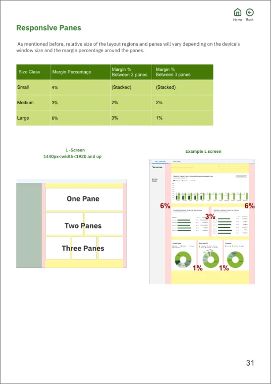
Adaptive layouts compatible with all devices, with one-, two- and three-pane report layouts.
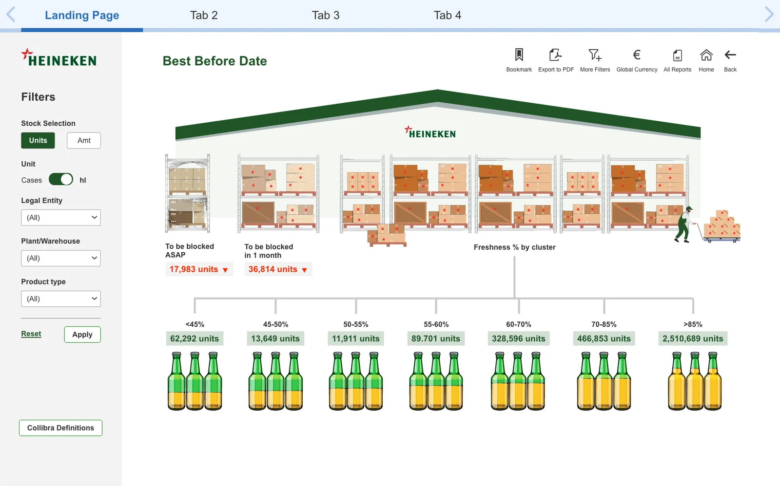
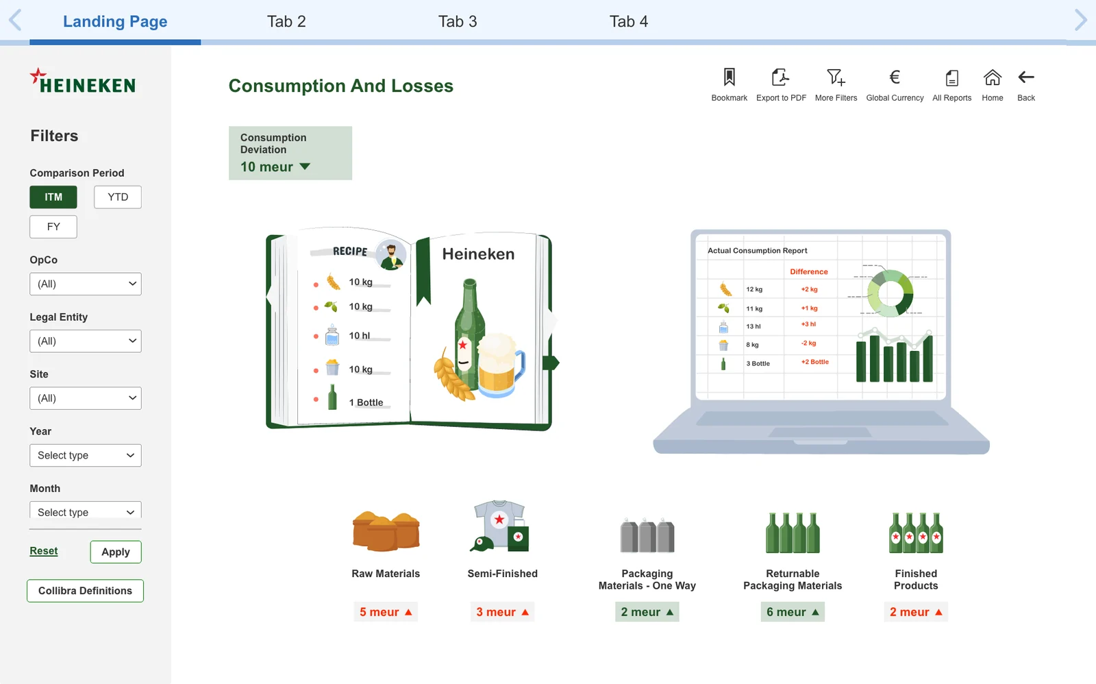
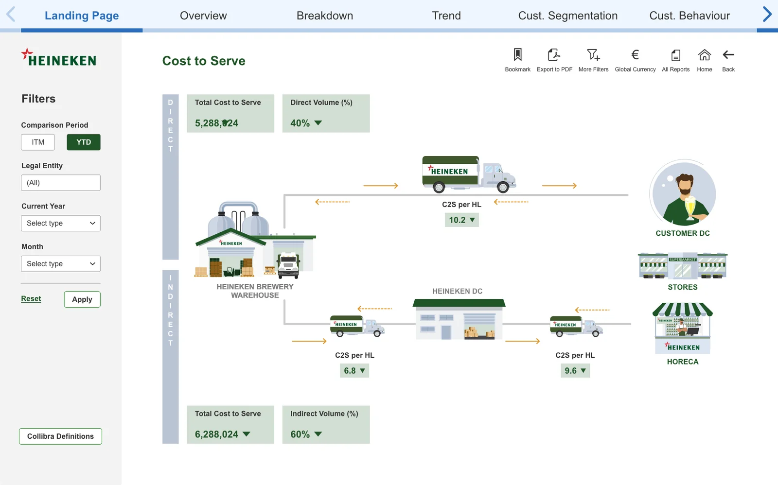
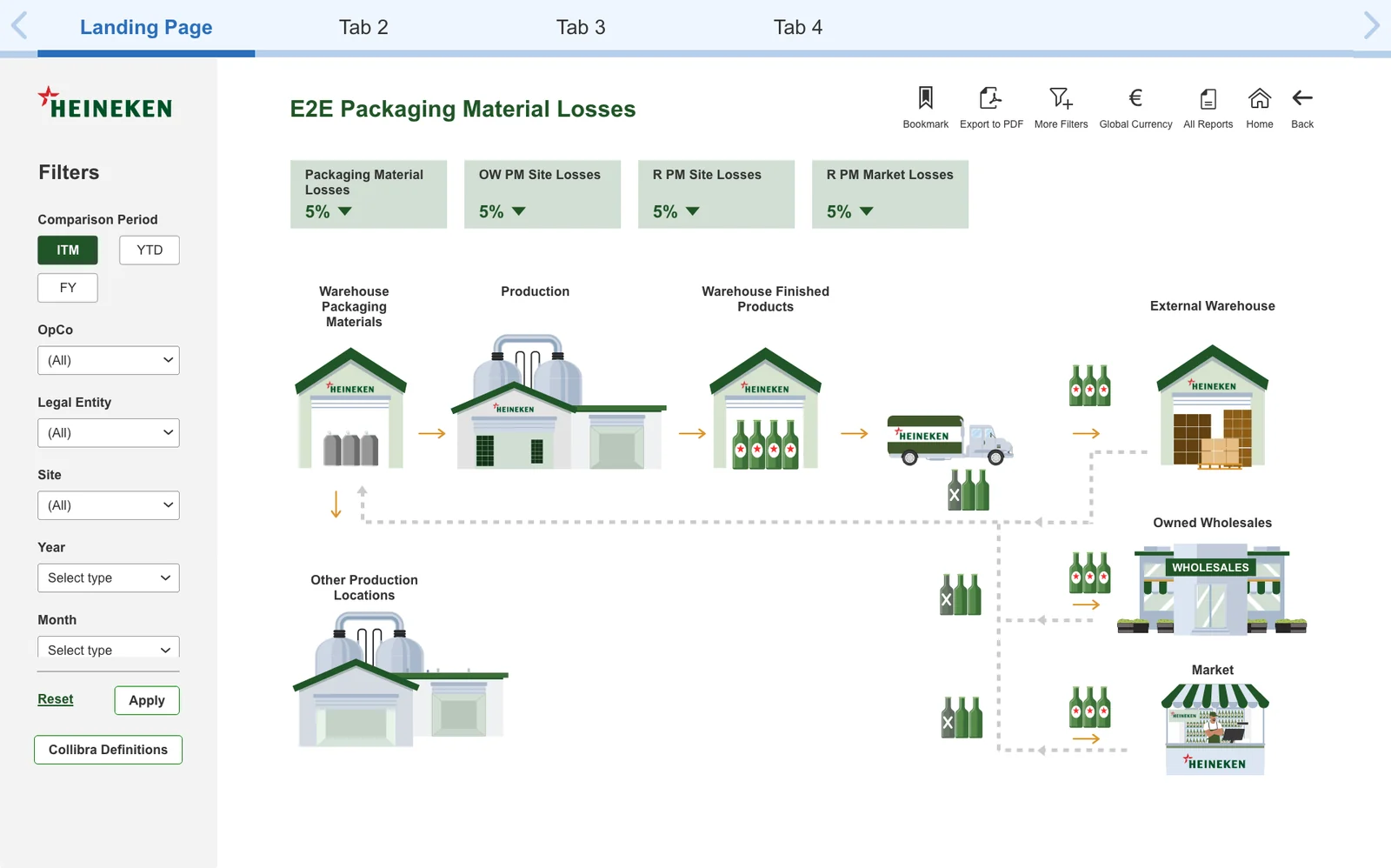
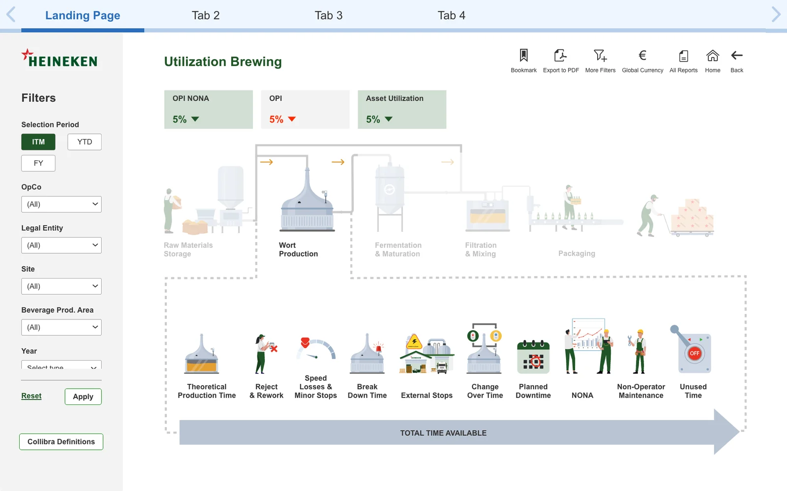
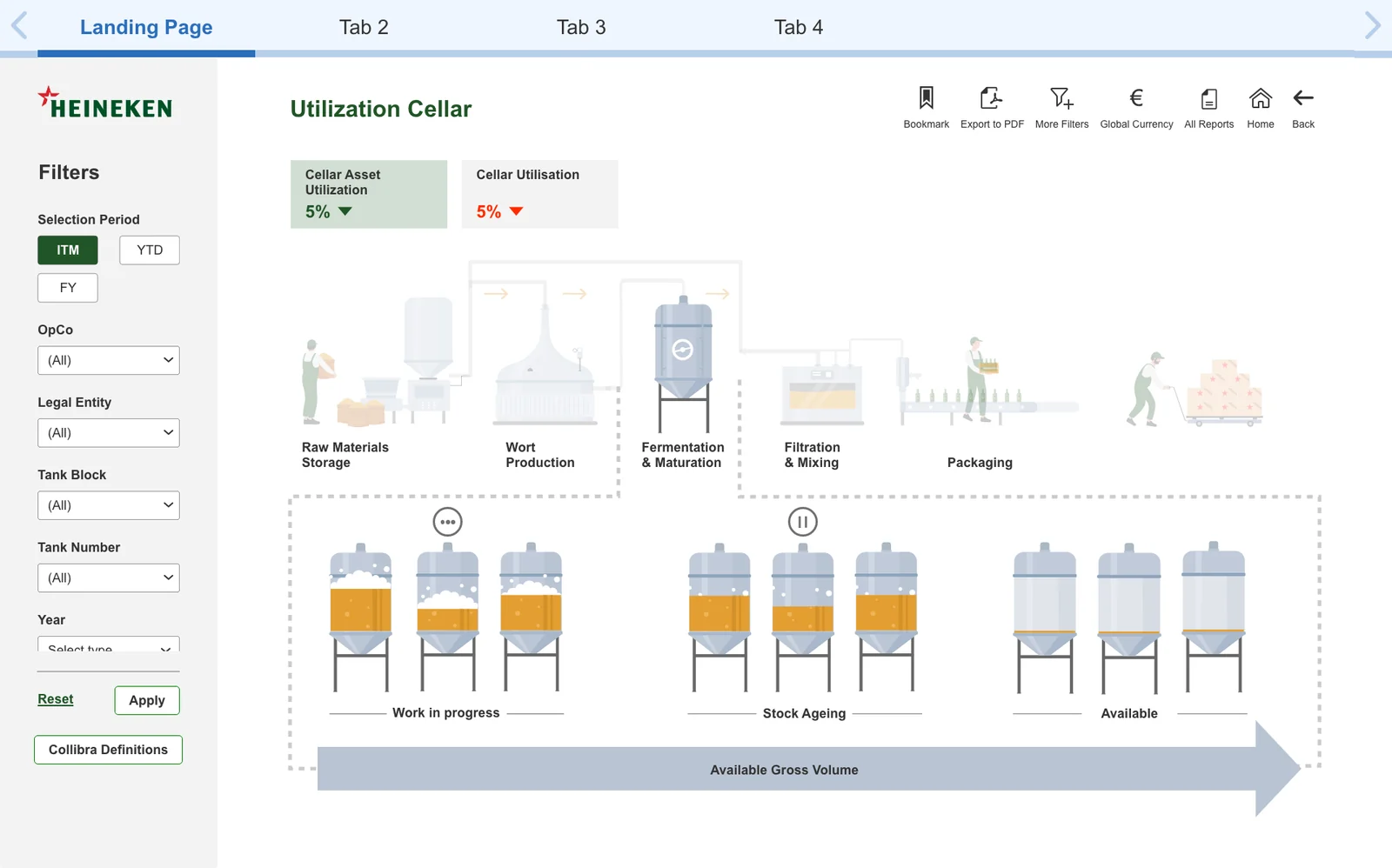
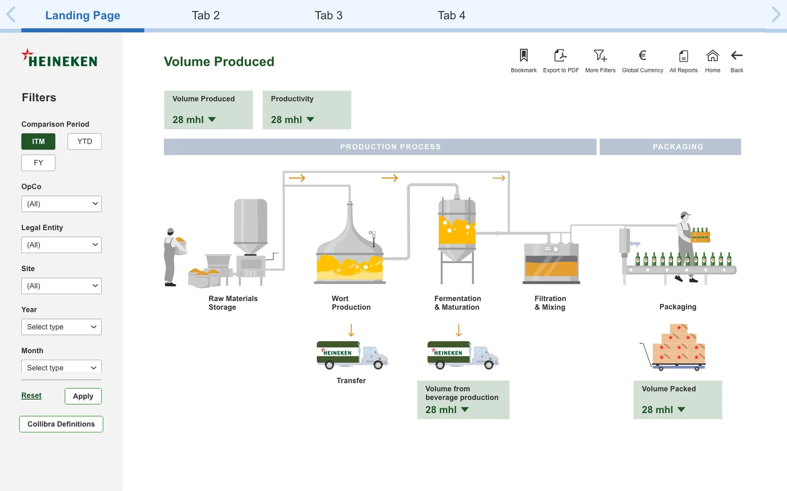
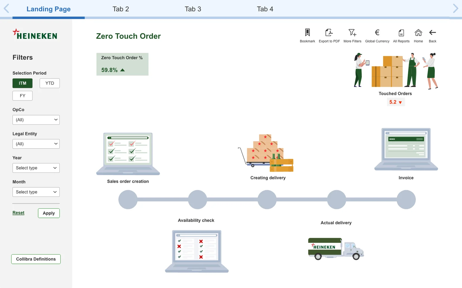
Landing page designs
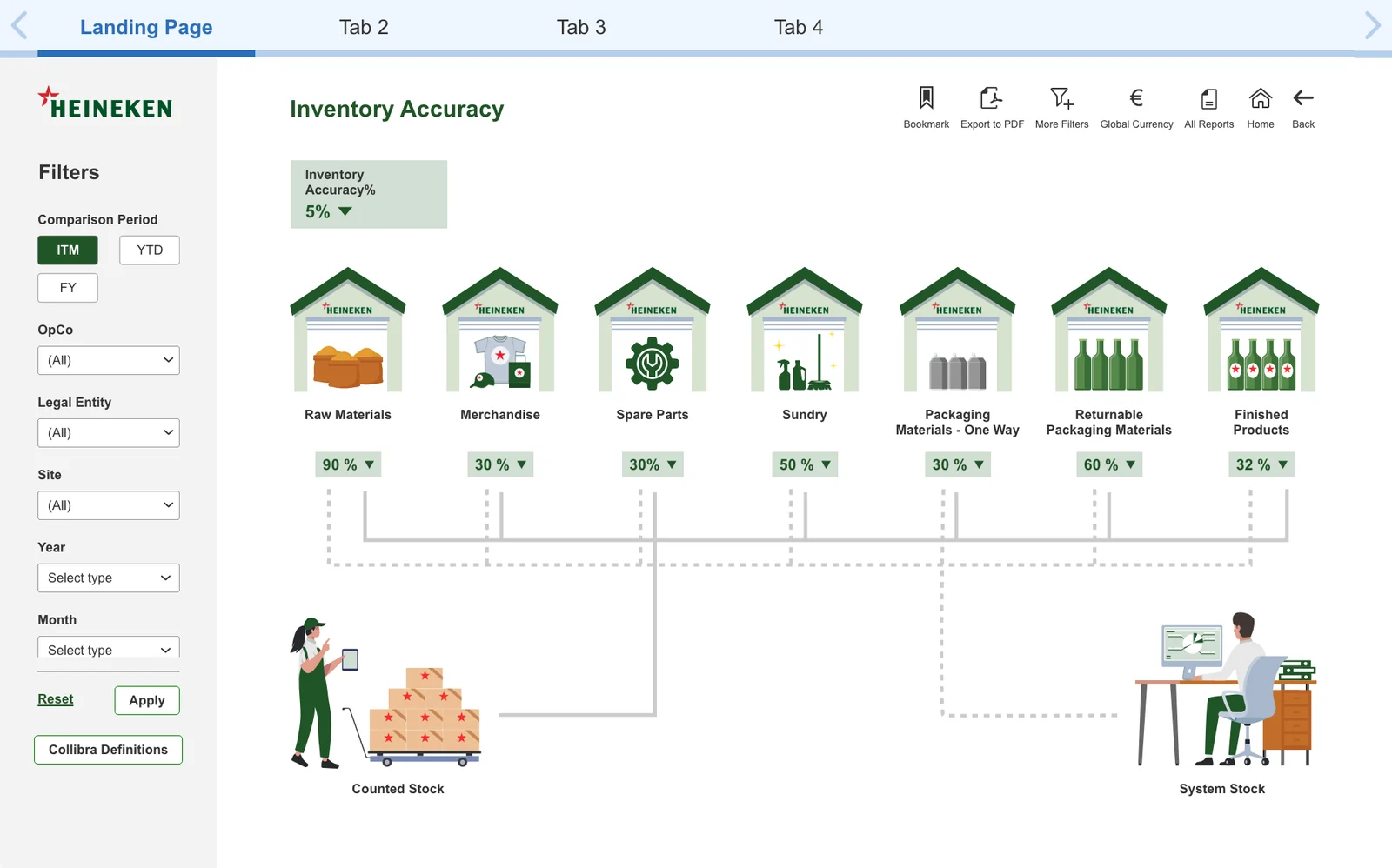
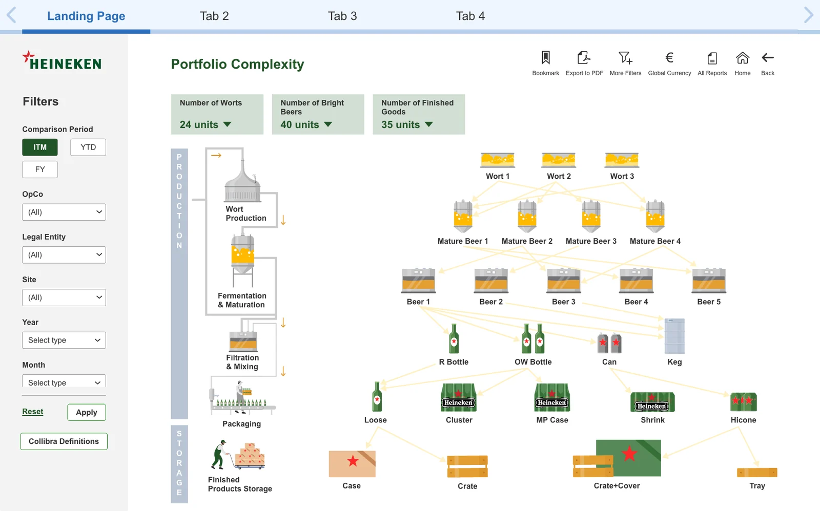
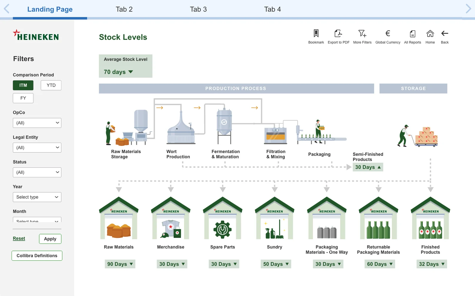
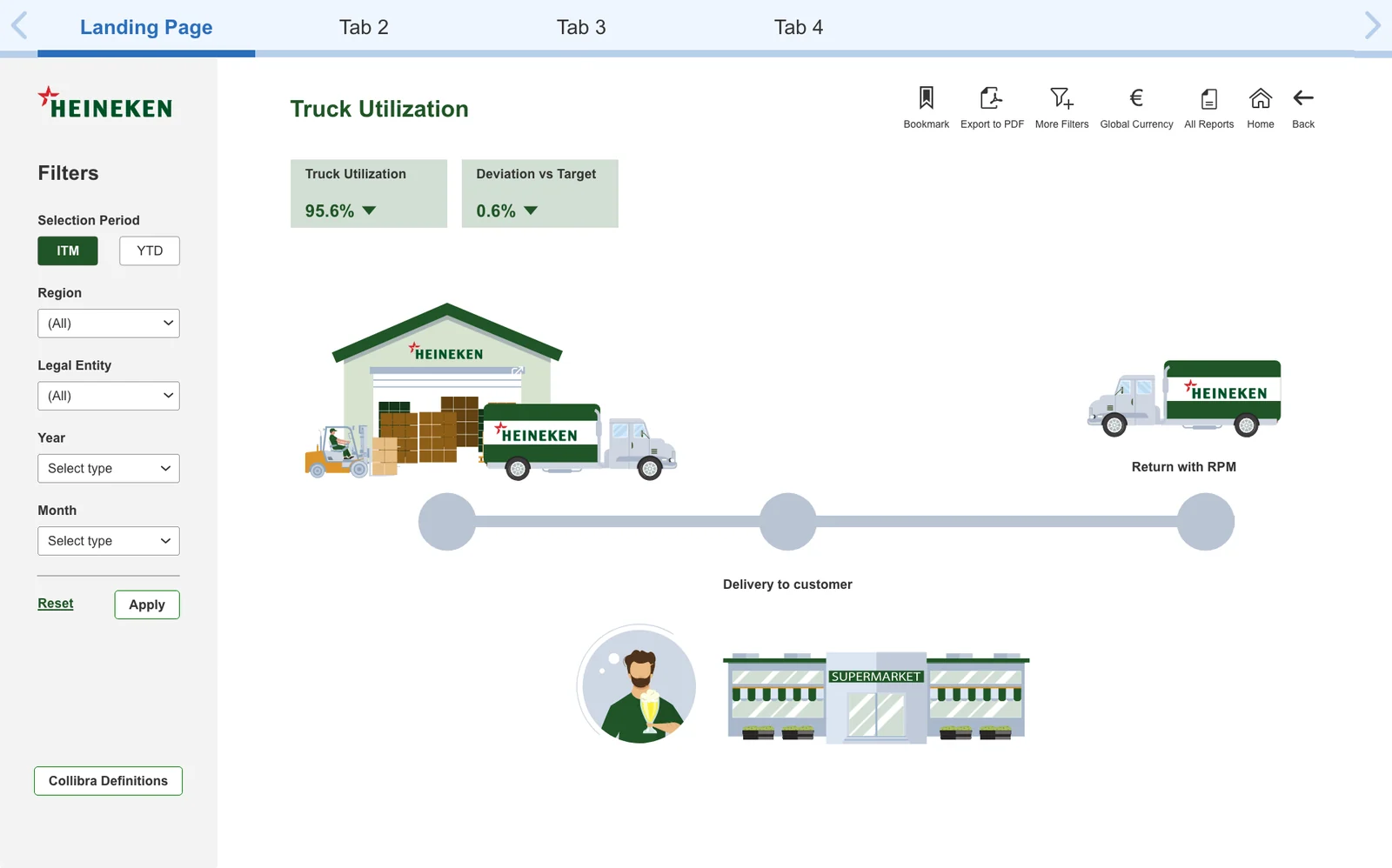
Illustrated landing pages that map each report to the supply chain it describes, from brewery to customer. Hover to pause.