01
Goal-gradient effect
People speed up as they see themselves getting closer to a goal.
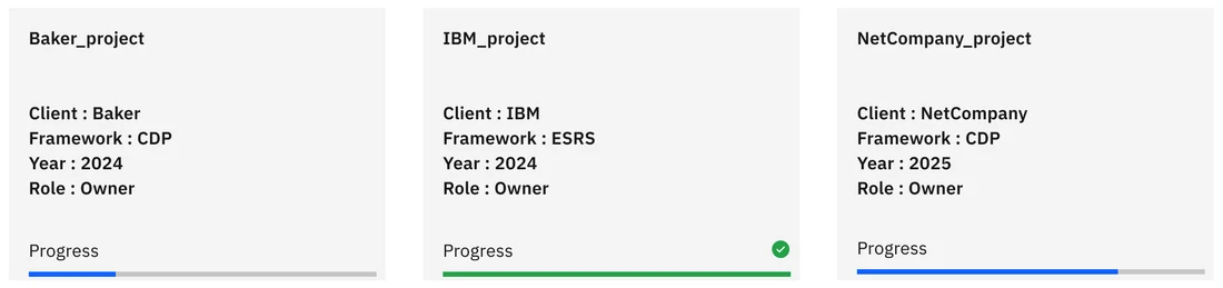
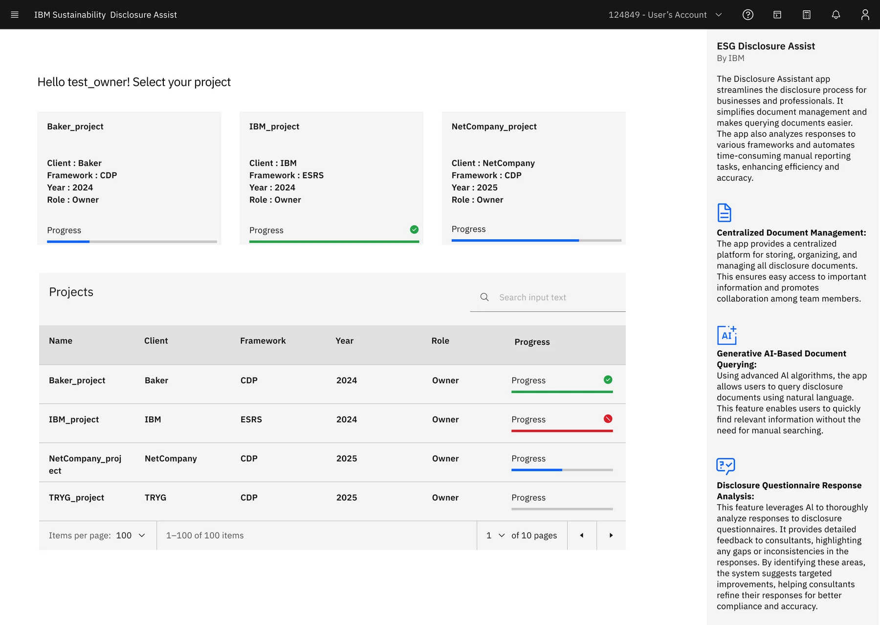
In Disclosure AssistEvery project card and table row shows a progress bar, with green for complete and red for a project that needs attention.
Redesign IBM · Internal tool · Generative AI
Sustainability consultants use Disclosure Assist to answer CDP and ESRS disclosure questionnaires for their clients. An AI drafts each answer from the client's own documents, then predicts how well it will score. I redesigned the legacy portal around the order that work actually happens in.
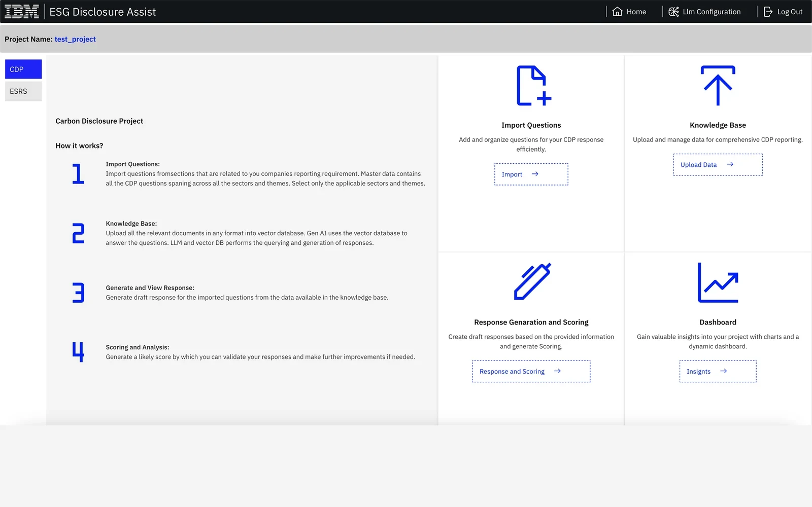
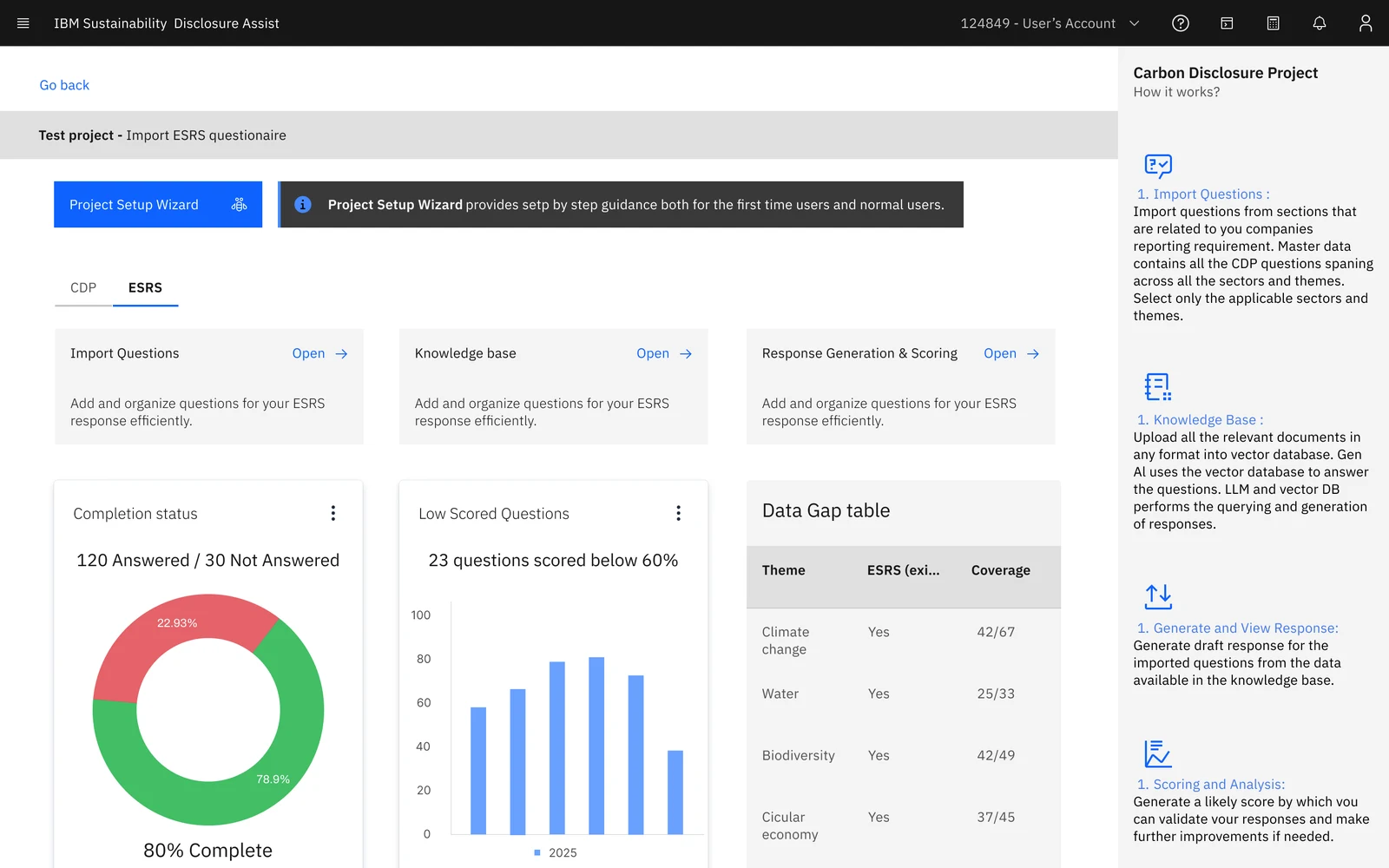 BeforeAfter
Context
A CDP or ESRS disclosure runs to hundreds of questions on climate, water, forests and more. Consultants answer each one with evidence scattered across a client's reports. Disclosure Assist uses generative AI to write the first draft, in four steps.
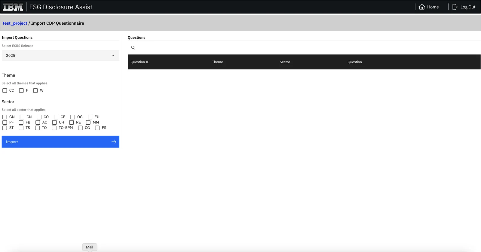
Import
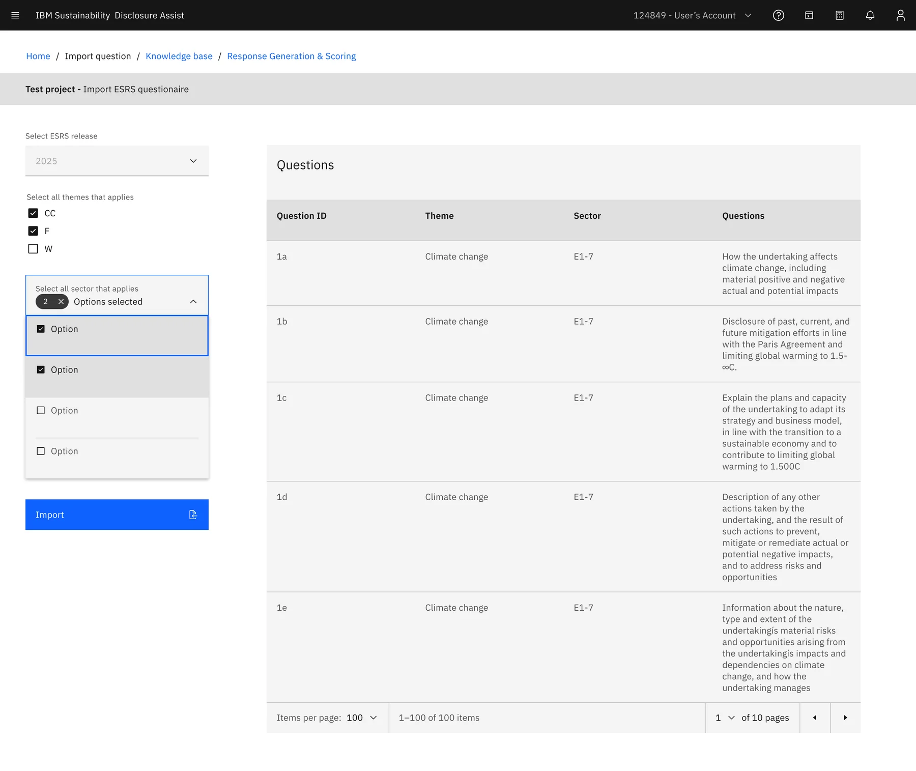
Choose the framework release, then the themes and sectors in scope. Matching questions come from a master list.
CDP 2025 · CC / F / W
Knowledge base
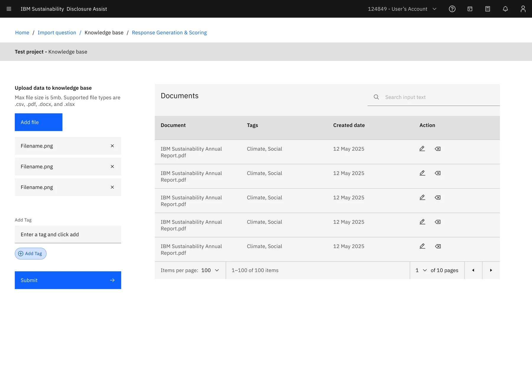
Add the client's reports and policies. They're stored in a vector database the AI searches.
.pdf · .docx · .xlsx · .csv
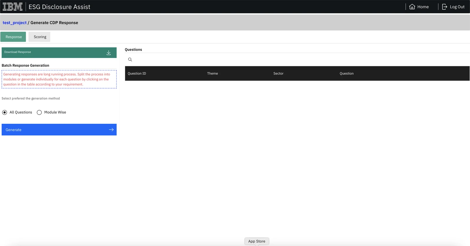
Generate
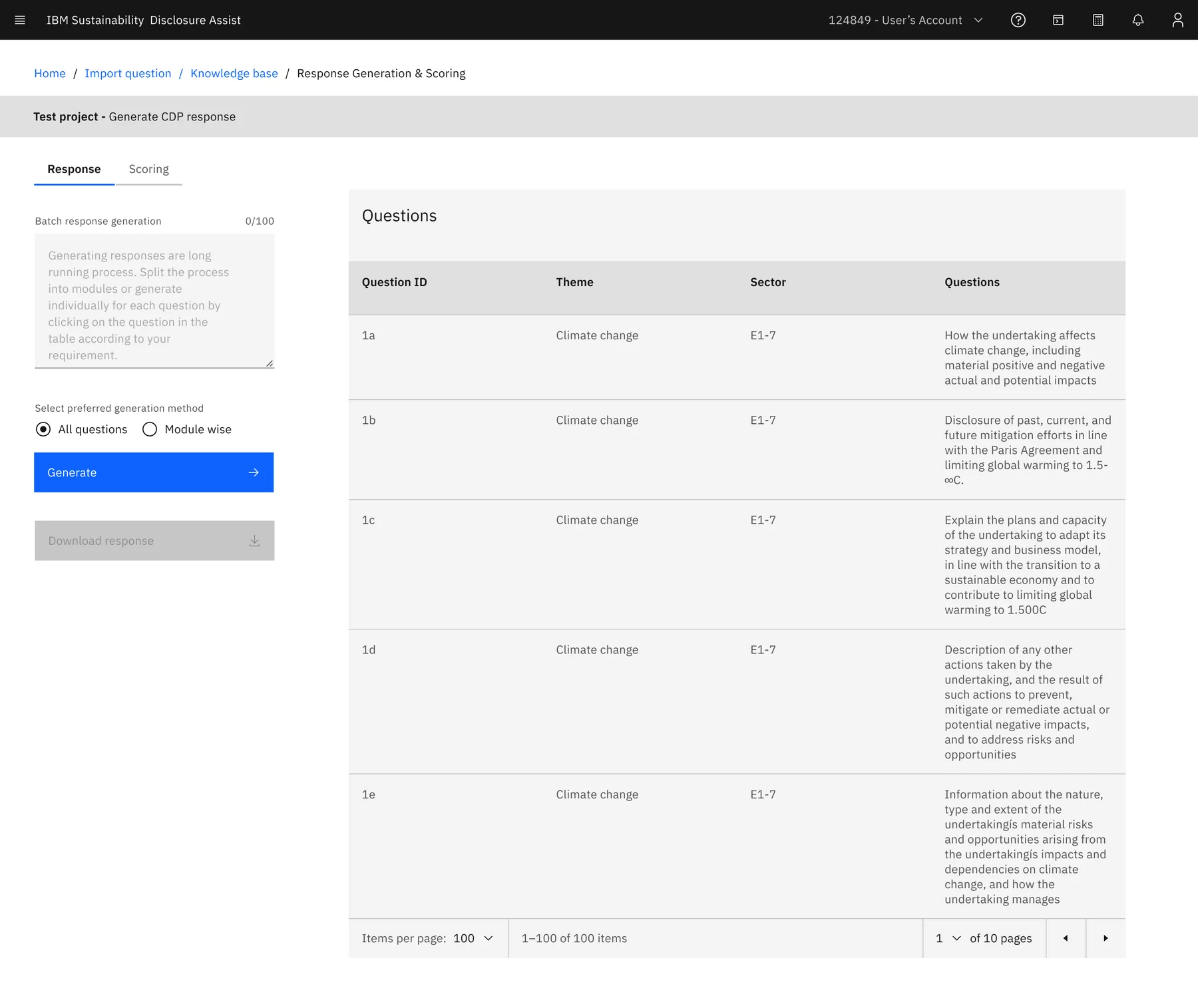
An LLM answers each question from the knowledge base: all at once, by module, or one at a time.
Batch or single question
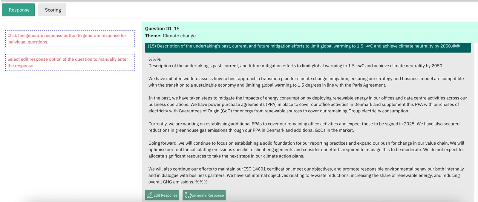
Score
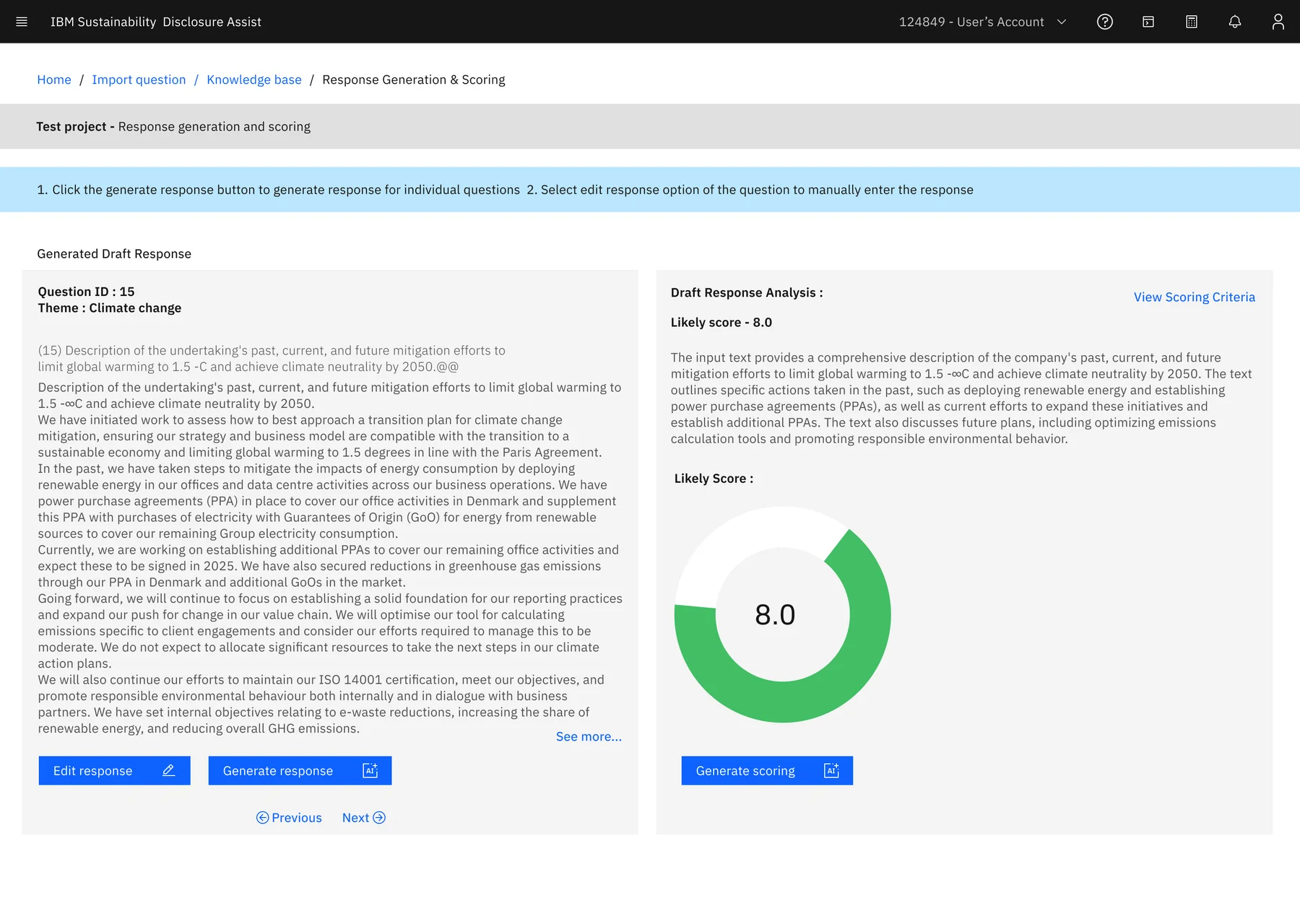
The AI predicts a likely score, explains the gaps, and the consultant edits before exporting.
Likely score · 8.0 / 10
ESG consultants who own a client project, and admins who manage users, projects, frameworks and the AI model.
The legacy portal exposed every step as a separate page, with no sense of order and no record of what was done.
Redesign the consultant journey on IBM's Carbon Design System, keeping every feature of the tool.
Audit
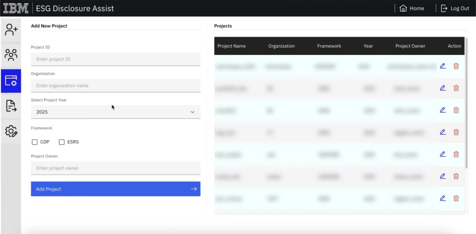
I had no brief document to work from, so I started by reading the old portal screen by screen to understand what it did and where it got in the way. Tap a marker to see each issue on the project page.
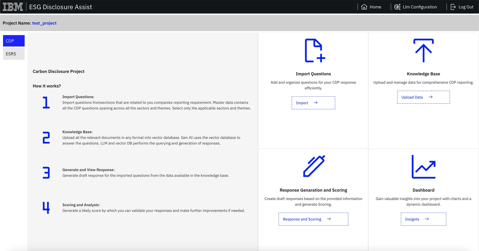
A permanent "How it works" essay filled the left half of every project, on every visit.
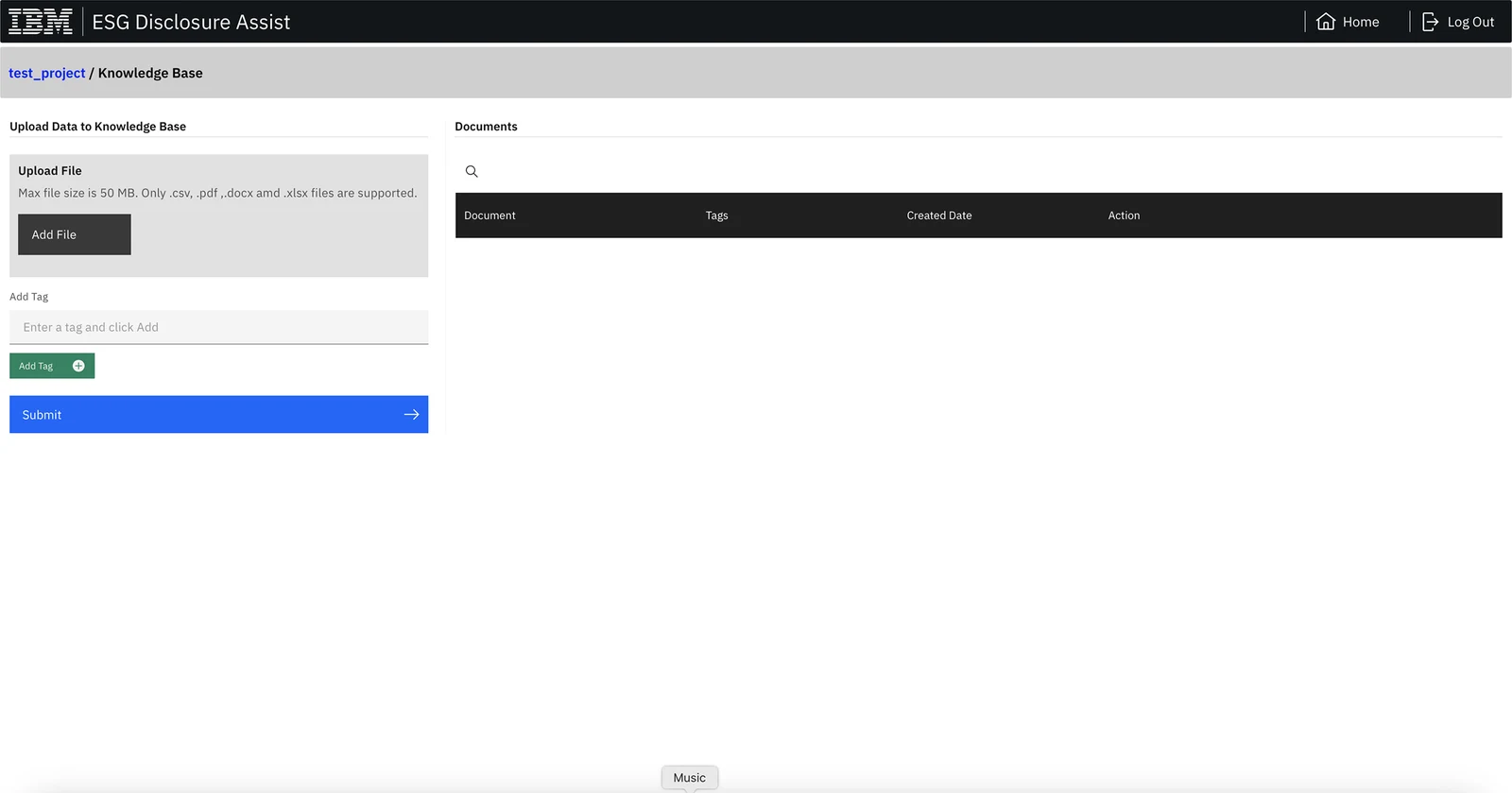
Dotted outlines made the main actions look like placeholders, not buttons.
Four equal tiles gave no order and no status. Nothing showed which steps were done.
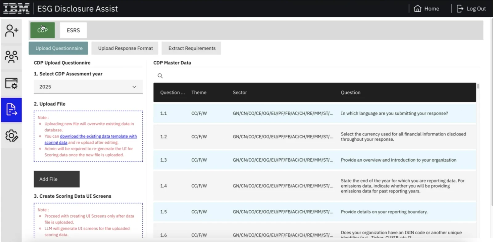
CDP and ESRS sat as two small tabs in the corner, yet they changed everything on the page.
"Response Genaration" and "fromsections" undermined trust in a tool that writes for clients.
Heuristic evaluation
I rated every heuristic on Nielsen's 0–4 severity scale, from cosmetic to catastrophic. For a tool that runs long AI jobs, the biggest gap was not knowing what was happening. Select a row to see where each problem appears.
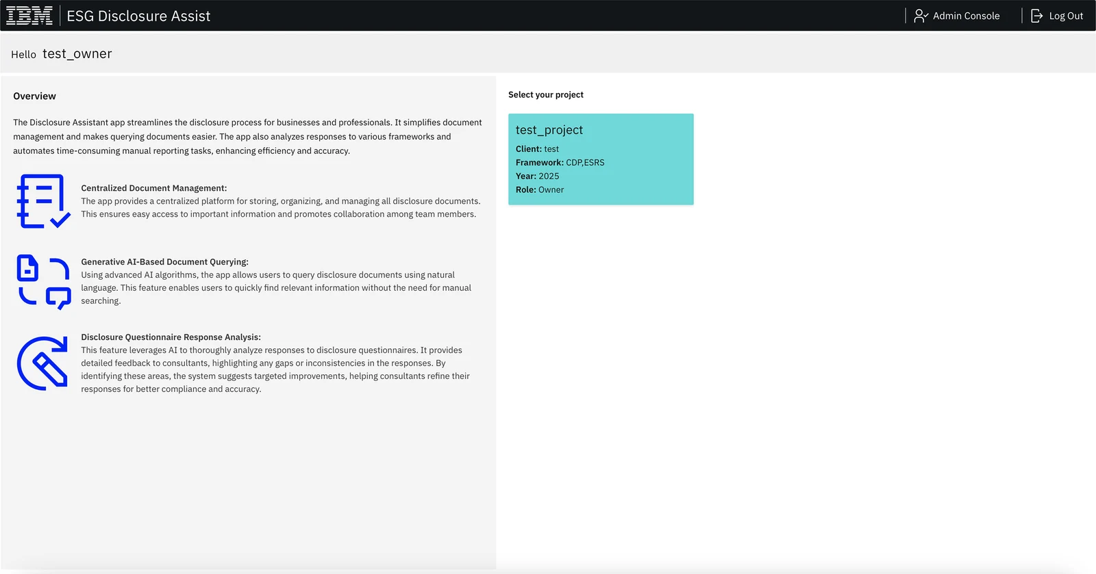
 H01
H01| # | Heuristic | What I found | Severity |
|---|---|---|---|
| H01 | Visibility of system status | Batch generation is called "a long running process", yet there is no progress bar, no count of answered questions and no status on projects. | Catastrophic |
| H06 | Recognition rather than recall | The four steps are separate pages behind equal tiles. Consultants must remember the order and which steps they've finished. | Major |
| H08 | Aesthetic & minimalist design | Half of the home page is a product overview that returning users never need, and the project page repeats it as "How it works". | Major |
| H04 | Consistency & standards | Four button styles on one form: dark grey "Add File", green "Add Tag", blue "Submit" and dotted outlines elsewhere. | Major |
| H05 | Error prevention | Uploading a new question file overwrites the existing data. The only warning is small red text in a dotted box. | Minor |
| H02 | Match with the real world | Themes and sectors appear only as codes (CC, F, W, GN, CN, TO-EPM), and the header offers "Llm Configuration". | Minor |
| H09 | Help users recover from errors | Empty tables show only a header row, with no message about what to do next. | Minor |
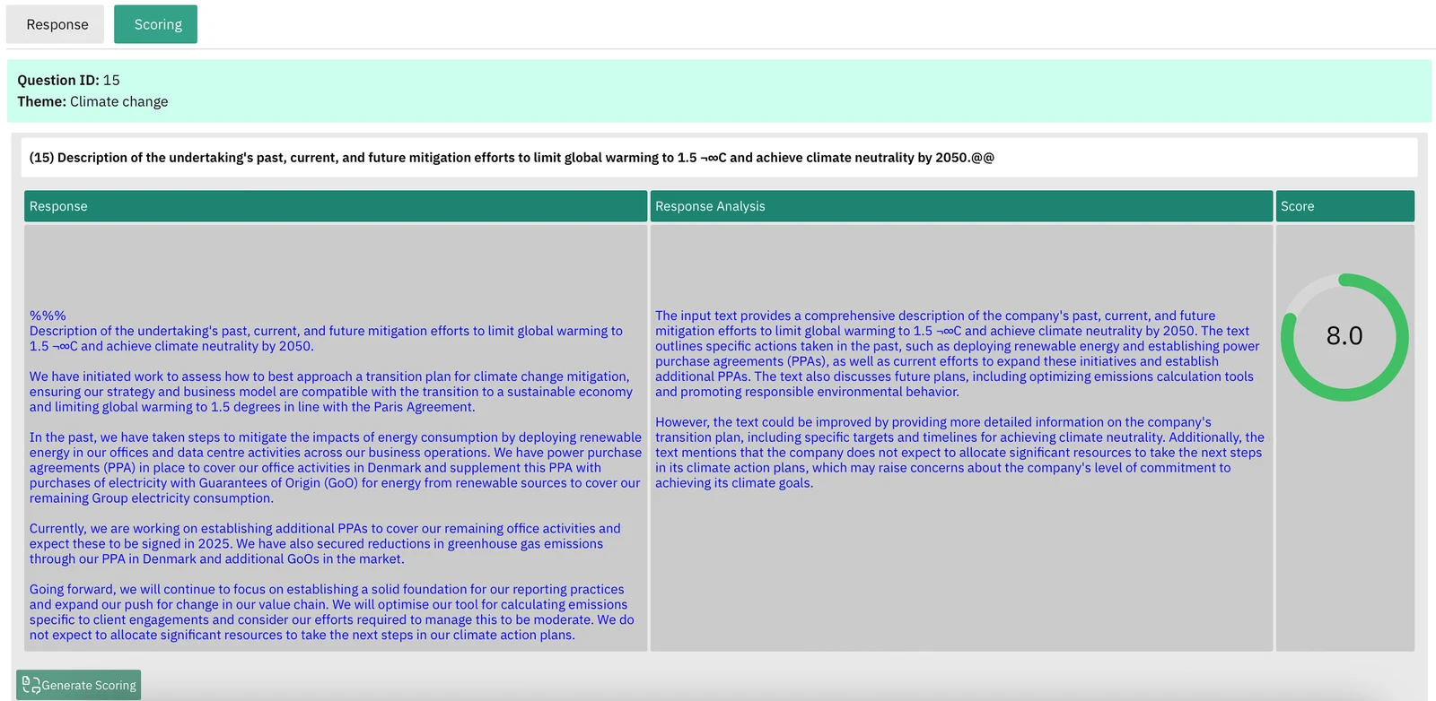
| H03 | User control & freedom | A generated answer sits in a read-only grey box. There is no way to move to the next or previous question from it. | Minor |
| H07 | Flexibility & efficiency of use | The draft and its score live on separate tabs, so reviewing each question means switching back and forth. | Minor |
| H10 | Help & documentation | Help is a block of static text with typos, with nothing in context at the step where it's needed. | Cosmetic |
Principles
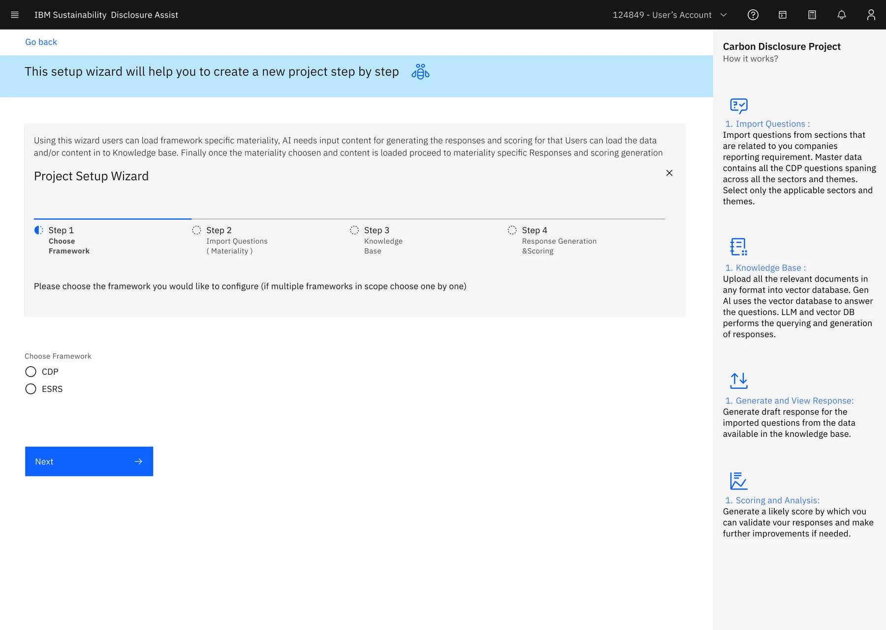
The four steps are a sequence, so the interface shows them as one: a setup wizard and a breadcrumb.
Progress on every project, and a dashboard of what's answered and what scored low.
An answer, the AI's analysis and the likely score in one view, with next and previous.
IBM's own design system, so it feels like other IBM tools and developers build from ready parts.
UX laws
Each decision in the redesign traces back to a well-known principle of how people perceive, decide and act.
01
People speed up as they see themselves getting closer to a goal.
In Disclosure AssistEvery project card and table row shows a progress bar, with green for complete and red for a project that needs attention.
02
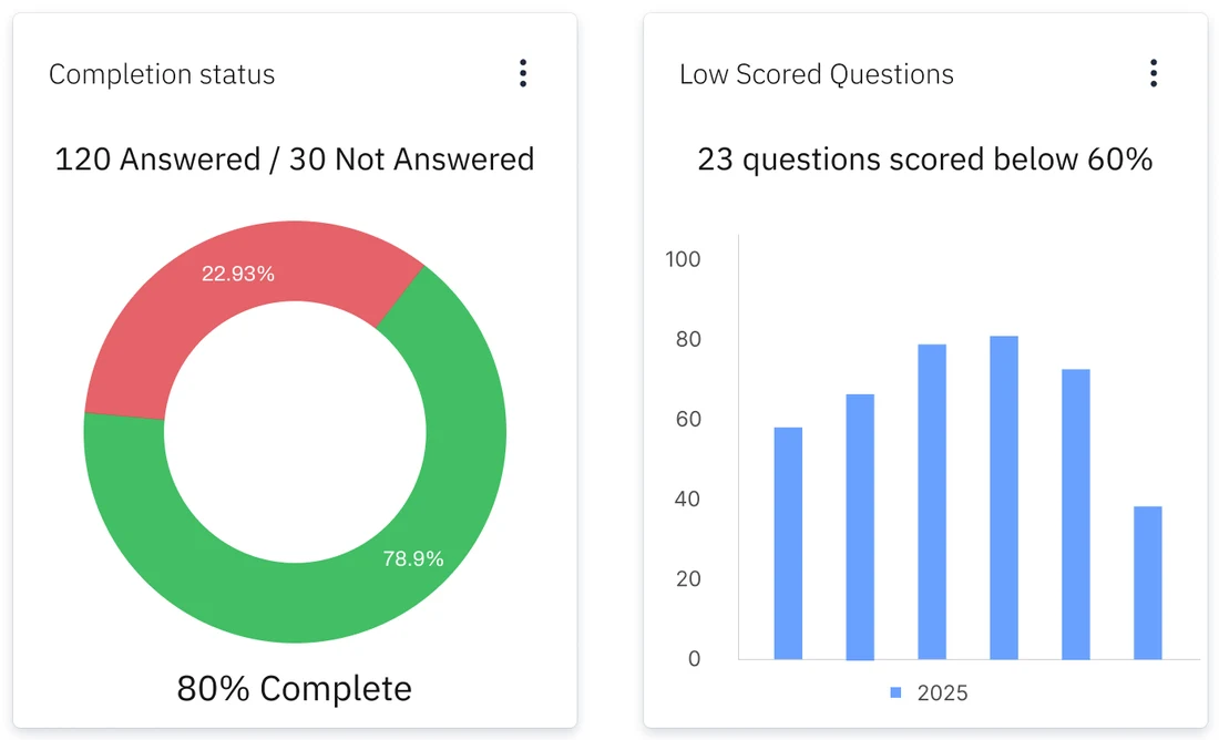
Unfinished tasks stay on our minds more than finished ones.
In Disclosure AssistThe dashboard leads with what's left: "120 answered / 30 not answered" and "23 questions scored below 60%".
03
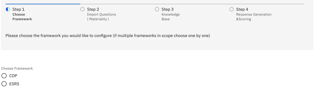
More choices, slower decisions.
In Disclosure AssistThe setup wizard asks for one decision per step, starting with a single choice: CDP or ESRS.
04
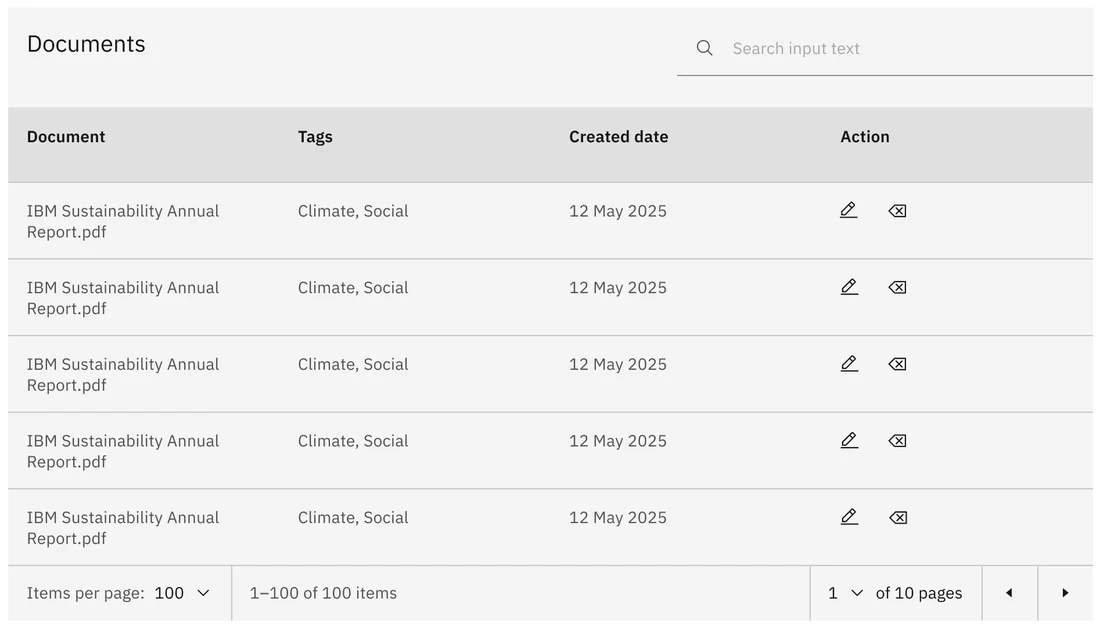
People expect a product to work like the others they already use.
In Disclosure AssistTables, search, pagination and file uploads use standard Carbon components, the same patterns found across IBM's tools.
05
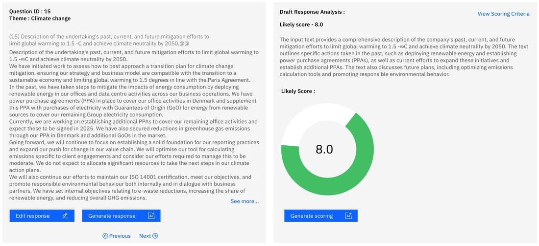
Things placed close together are read as related.
In Disclosure AssistThe draft answer sits right next to its analysis and likely score, instead of on a separate Scoring tab.

06
Things inside a shared boundary read as a group.
In Disclosure AssistEach step is its own tile with an Open link, and the "How it works" help moved to a separate side panel.
Before & after
The old project page and the new project dashboard, shown whole and side by side. Select either screen to see it full size.
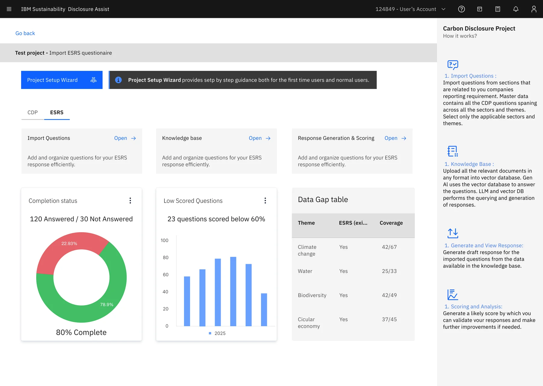
Or drag the slider to see the same page change in place.
Five parts of the consultant journey, compared side by side.
My redesign
The redesigned consultant journey, built on Carbon. The setup wizard walks a first-time user through all four steps. Returning users go straight to the dashboard.
Four steps with a progress indicator. Each step explains why it matters, and Next unlocks once the step is done.
The project home. Step tiles for CDP or ESRS, then completion status, low-scored questions and a data gap table showing coverage by theme.
Recent projects as cards, every project in a searchable table, and progress on each. The product overview sits in a side panel.
The draft answer, the AI's analysis and the likely score together, with edit, regenerate and rescore actions, and Previous and Next to move through the questionnaire.
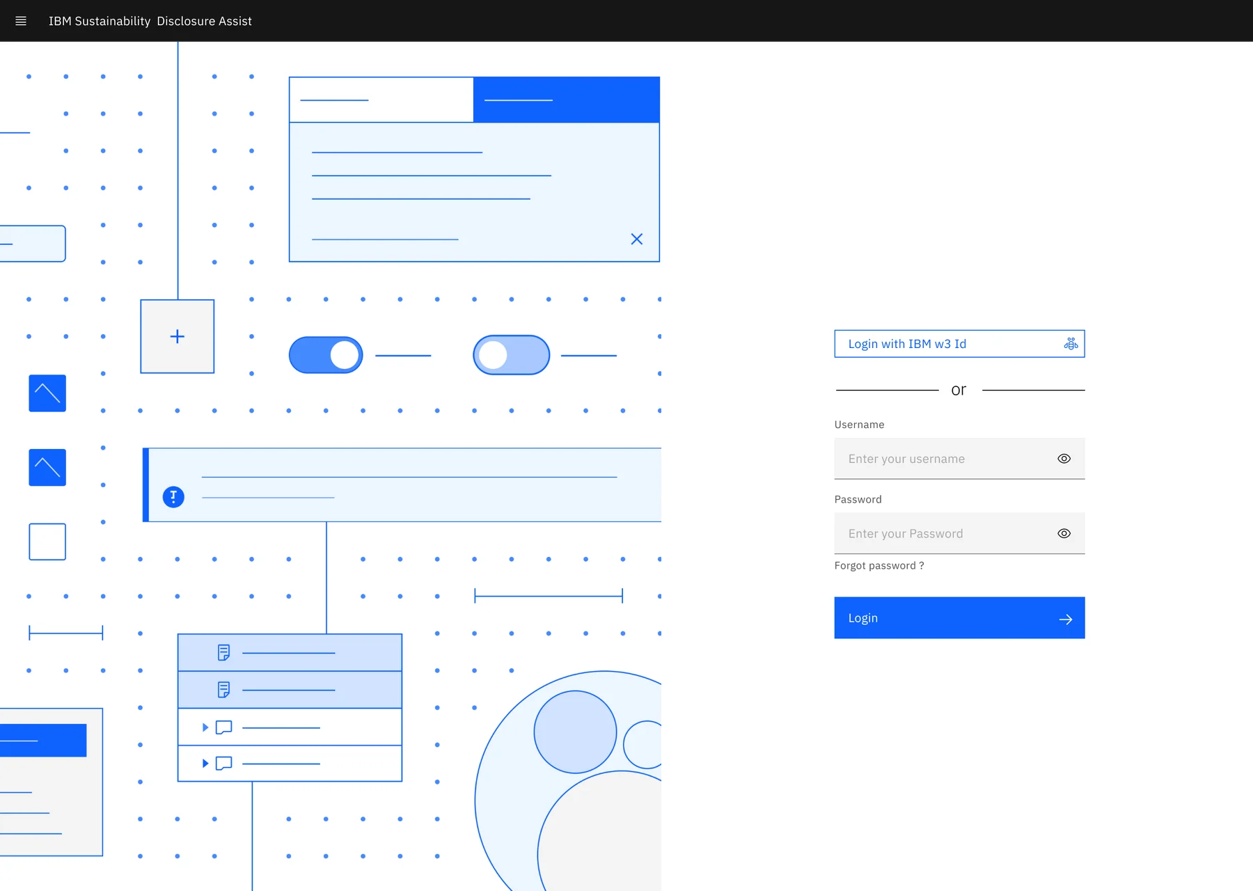
Sign in with an IBM w3 ID or a username for external users, beside an illustration drawn from Carbon's own shapes.
Visual system
Instead of the old portal's custom mix of colours, the redesign uses Carbon's tokens and components as they are.
Questions, documents and projects, all with search and pagination.
The four wizard steps, with complete, current and upcoming states.
Step tiles on the dashboard, and CDP / ESRS and Response / Scoring tabs.
Outcome
New consultants follow a four-step wizard instead of guessing the order of four tiles.
Projects, questions and scores now report their status, so long AI jobs don't feel like a black box.
Draft, analysis and score on one screen cut the tab switching for every question.
This case study covers the consultant journey; I haven't included usage data. The next step would be to watch consultants run a full CDP questionnaire on the new screens and measure how long review takes per question.
Feedback
Overall great experience working with Prashik. I will prefer to work with him again.
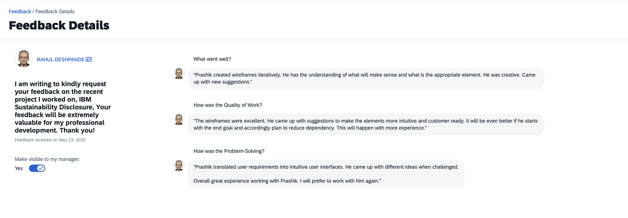
From IBM's internal feedback tool, received on May 23, 2025.