01
Hick's law
More choices, slower decisions.
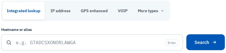
In ACTIONTen search types and five tiles became four tabs plus "More types". The common lookups are one click, the rare ones stay reachable.
Redesign AT&T × IBM iX · Internal tool
I redesigned an existing internal portal that service engineers use to look up devices, sites and customers before they carry out work offline. Same data and features, rebuilt around finding the right device fast.
Context
ACTION brings together device, site and customer data from several AT&T databases. Service engineers search it for a hostname, IP address or site, then take that information into work they carry out offline.
Service engineers who need a specific device's details quickly and accurately.
Just before a task. Whatever they don't find now, they won't have in the field.
Redesign the ACTION home, search and results screens in 10–12 days, working solo.
Audit
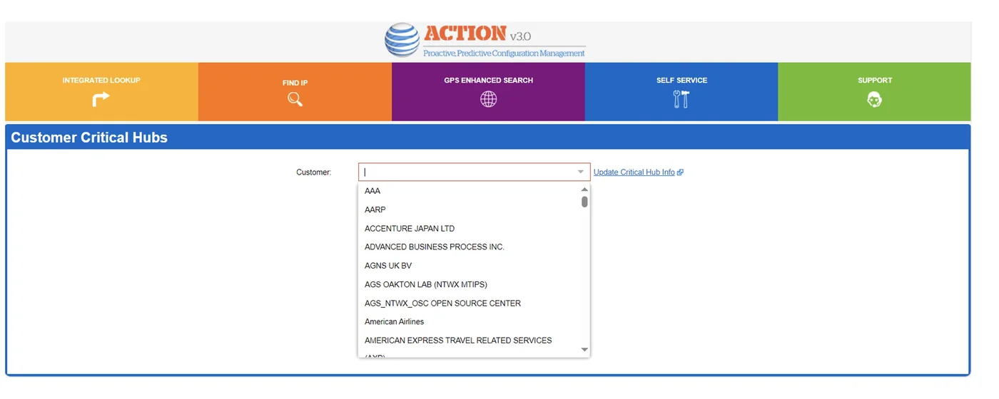
With no time for formal research, I started by auditing the existing ACTION v3.0 portal. Tap a marker to see each issue.
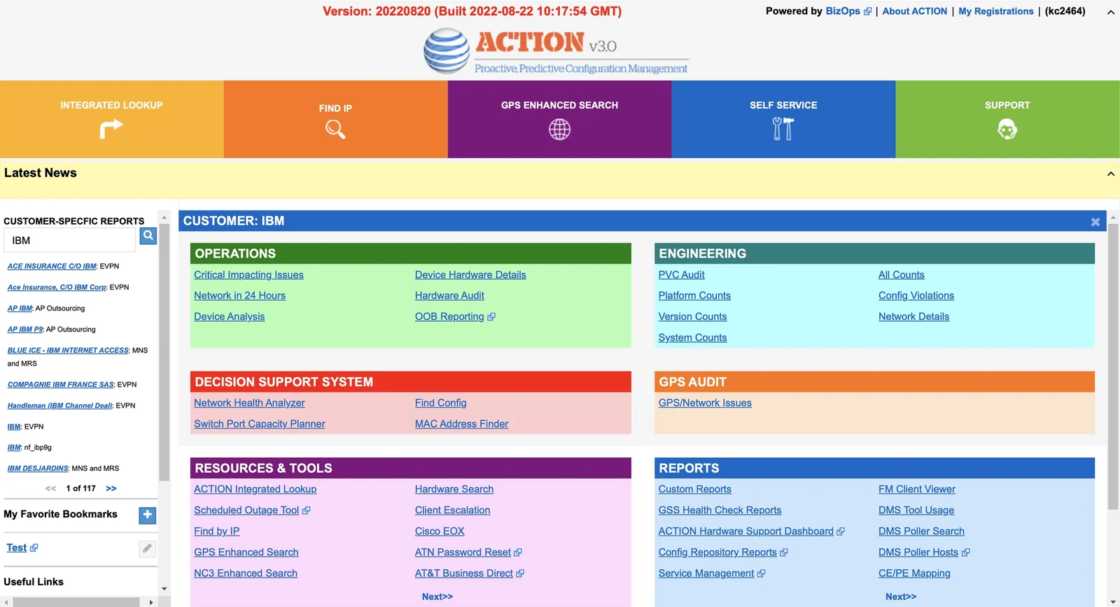
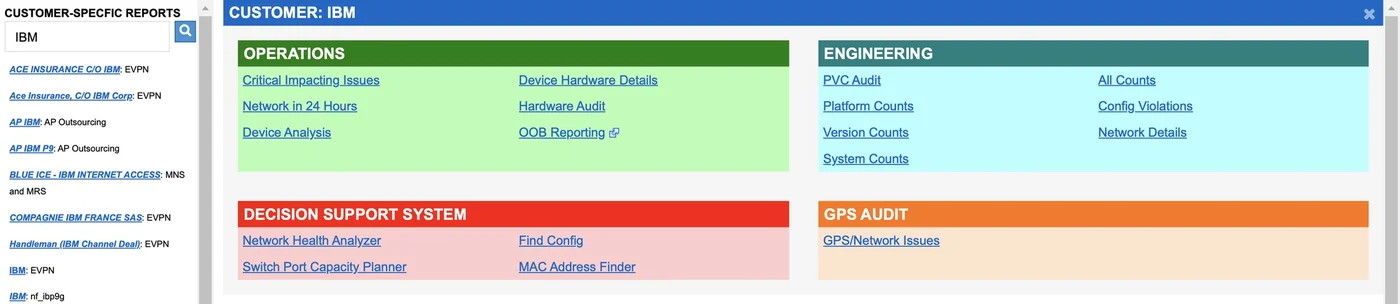
Each navigation tile and report group had its own saturated colour, so nothing signalled what mattered most.
A red build-version banner and admin links took the most prominent spot on the page.
Customer reports sat in a narrow scrolling panel with its own pagination.
Dozens of identical blue links, some opening external tools, with no way to tell them apart at a glance.
Nested scroll areas and "Next>>" pagination inside tiles hid half the tools.
Heuristic evaluation
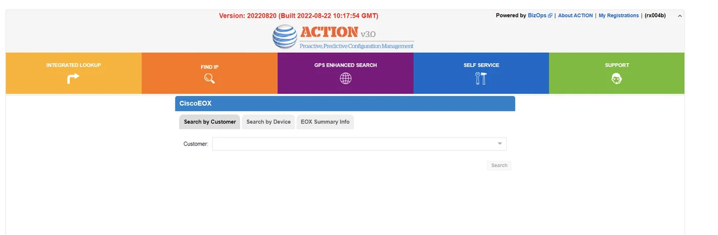
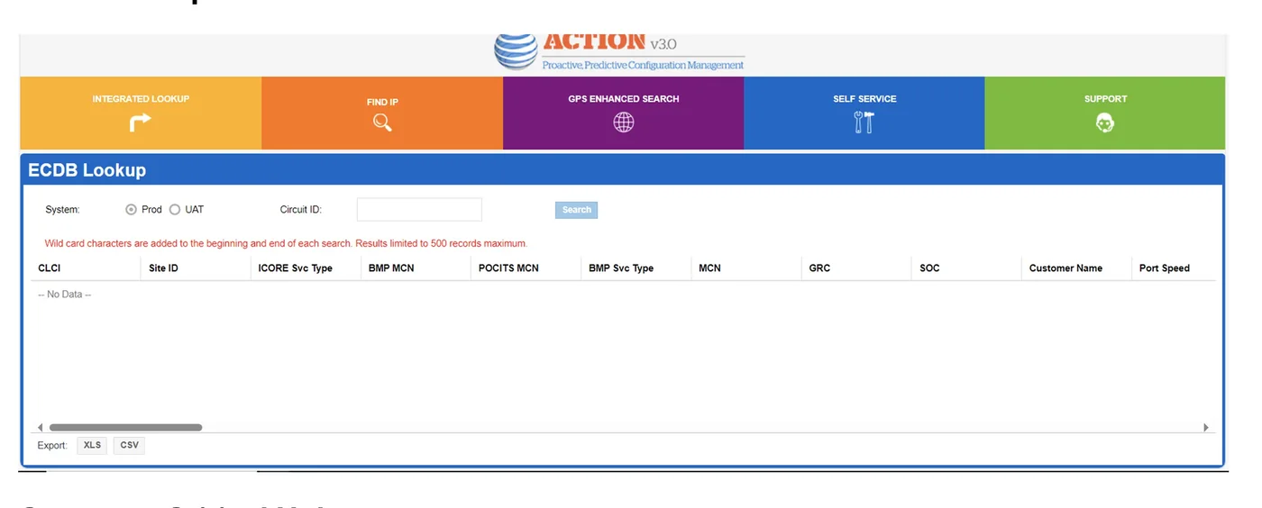
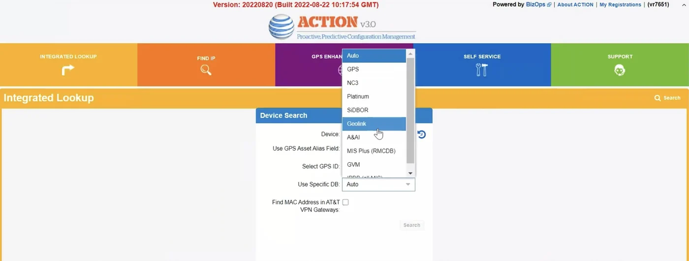
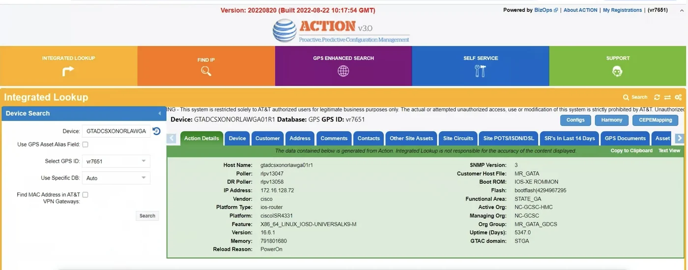
I rated every heuristic on Nielsen's 0–4 severity scale, from cosmetic to catastrophic. The worst problems were structural, not visual polish. Select a row to see where it happens on the old screen.
 H08
H08| # | Heuristic | What I found | Severity |
|---|---|---|---|
| H08 | Aesthetic & minimalist design | Five saturated colour blocks, a news banner, a sidebar and six link groups compete on one screen. | Catastrophic |
| H04 | Consistency & standards | Every group has its own colour scheme. Internal and external links look identical, and link styles vary between panels. | Major |
| H06 | Recognition rather than recall | Search types sit behind a dropdown and five tiles, so engineers must remember where each lookup lives. | Major |
| H05 | Error prevention | The database dropdown lists 15+ sources with no default guidance, and hostnames have no example or validation. | Minor |
| H01 | Visibility of system status | The most prominent status on the page is a red build-version banner. Tables show "No Data" with no loading or empty states. | Minor |
| H03 | User control & freedom | Refining a search means reopening a collapsed side panel; there is no way to clear or reuse recent lookups. | Minor |
| H07 | Flexibility & efficiency of use | No recent searches or shortcuts for repeat lookups; bookmarks are buried at the bottom of a scrolling sidebar. | Minor |
| H09 | Help users recover from errors | Empty results give no reason and no next step. | Minor |
| H02 | Match with the real world | Terms like SIDBOR and NC3 suit expert engineers, but tile labels such as "Self service" are vague. | Cosmetic |
| H10 | Help & documentation | Help is limited to an "About ACTION" link in the header. | Cosmetic |
Principles
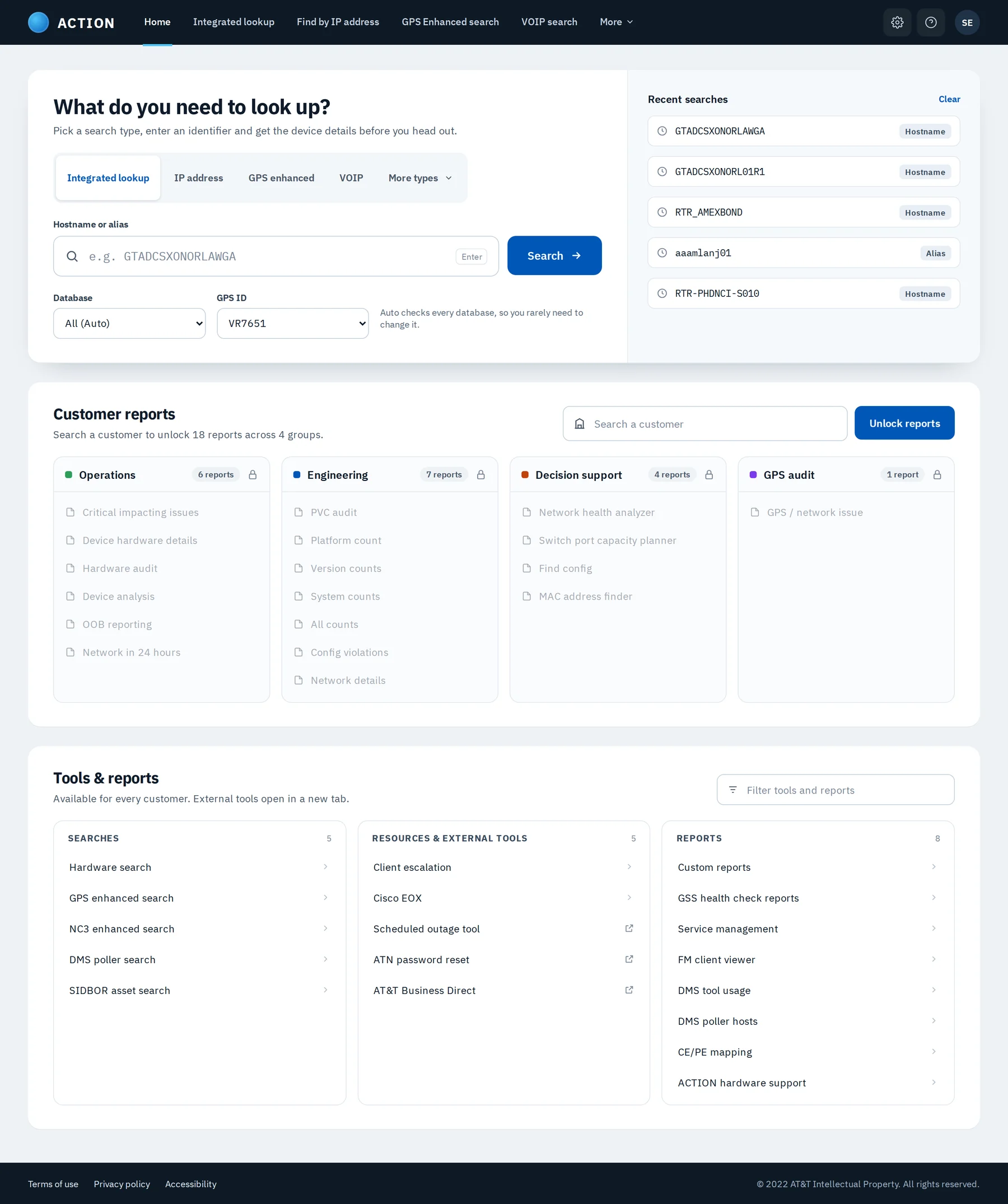
The first thing on the page is the question engineers came to answer.
Hostnames and serials in a monospaced face, so similar IDs don't blur together.
Blue means "act here". Everything else steps back.
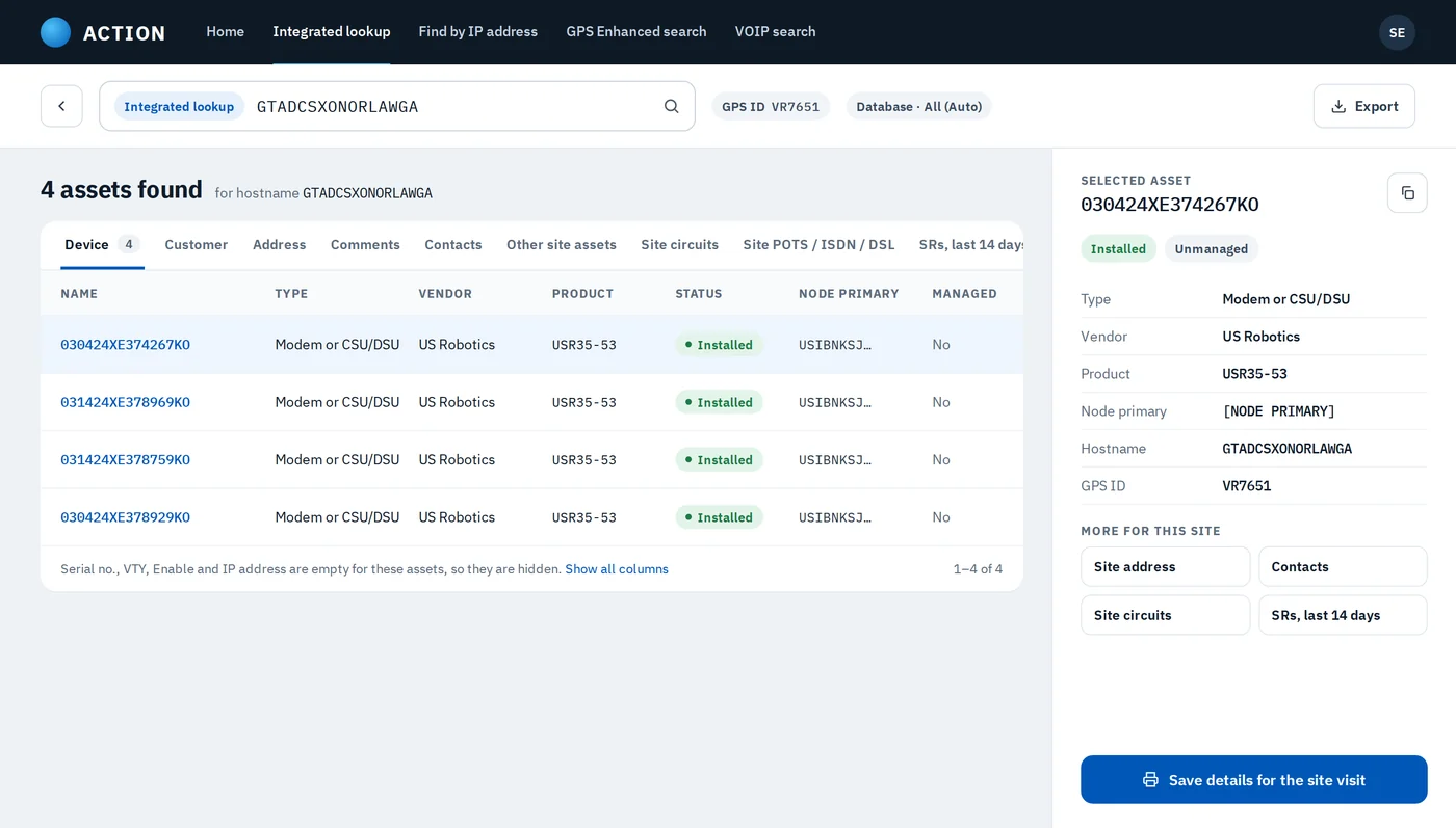
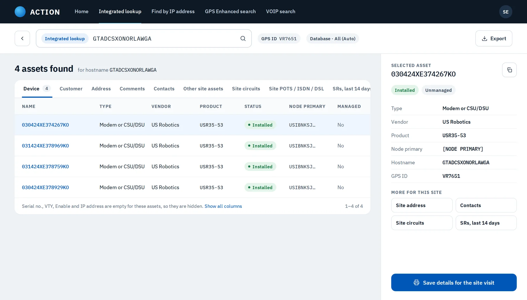
Every result can be saved before the engineer goes offline.
UX laws
Each decision in the redesign traces back to a well-known principle of how people perceive and act.
01
More choices, slower decisions.
In ACTIONTen search types and five tiles became four tabs plus "More types". The common lookups are one click, the rare ones stay reachable.

02
Big, close targets are faster to hit.
In ACTIONA 56px search field with the Search button right beside it, instead of a small button below the form.
03
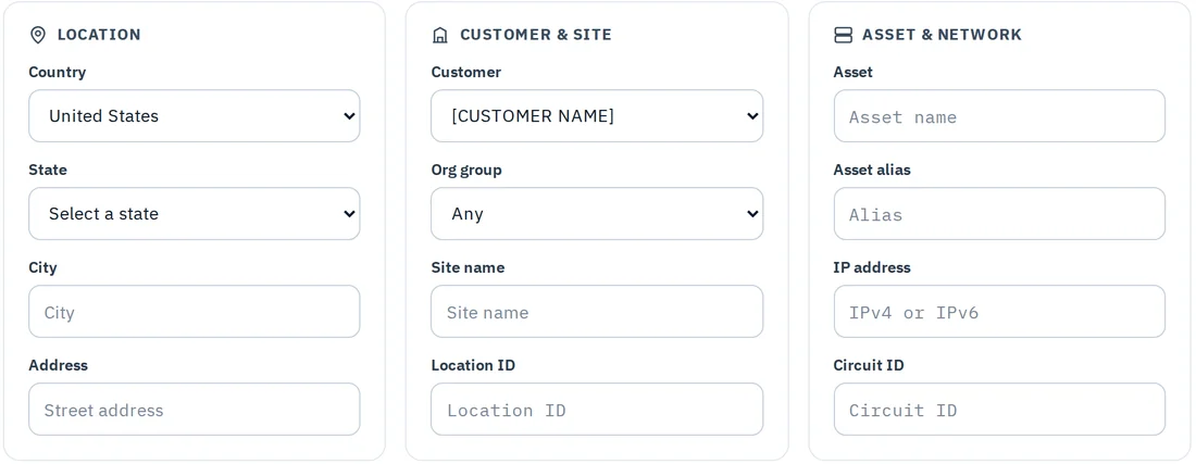
People hold about 7 ± 2 items in mind.
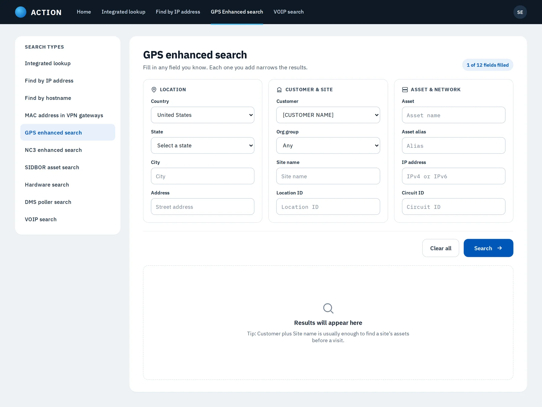
In ACTIONGPS search's 12 loose fields are chunked into three groups of four: Location, Customer & site, and Asset & network.
04
Things inside a shared boundary read as a group.
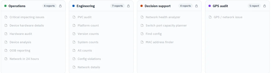
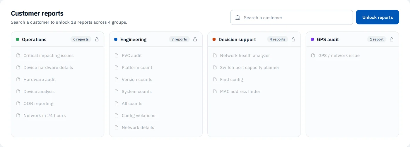
In ACTIONEach report group sits in its own card with a count, replacing colour-coded blocks that bled into one another.

05
The one item that differs is the one remembered.
In ACTIONBlue is reserved for the primary action on every screen, so "Search" and "Save details" always stand out.

06
Complexity has to live somewhere, so the system should carry it.
In ACTIONThe database defaults to "All (Auto)" with a note, so engineers no longer pick from 15+ sources.
Before & after
The original ACTION v3.0 home page and my redesign, shown whole and side by side. Select either screen to see it full size.
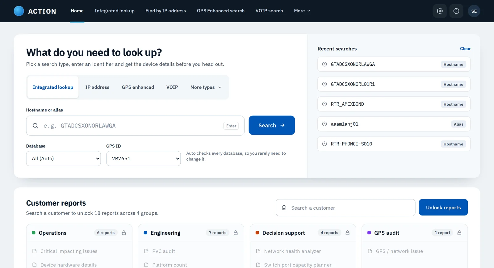
Or drag the slider to see the same screen change in place.
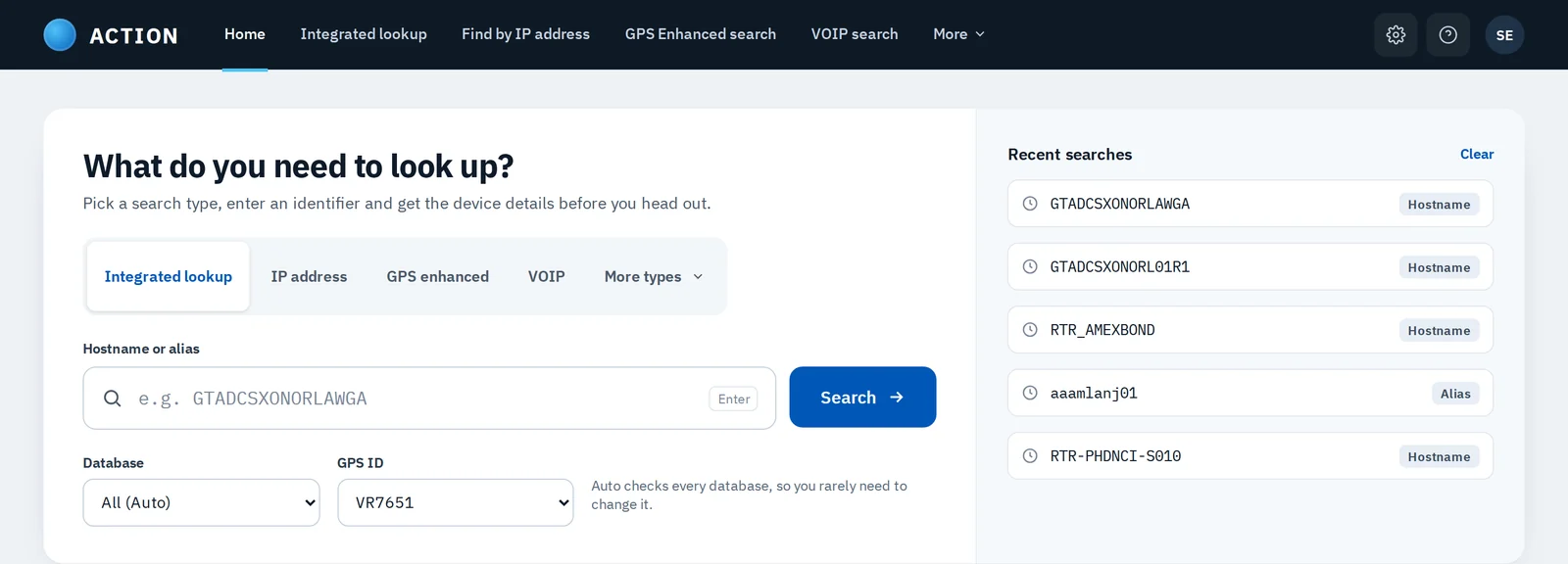
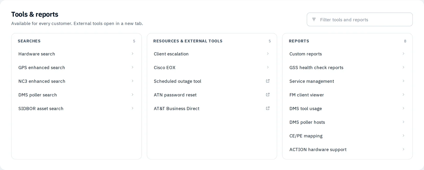
Five parts of the portal, compared side by side.

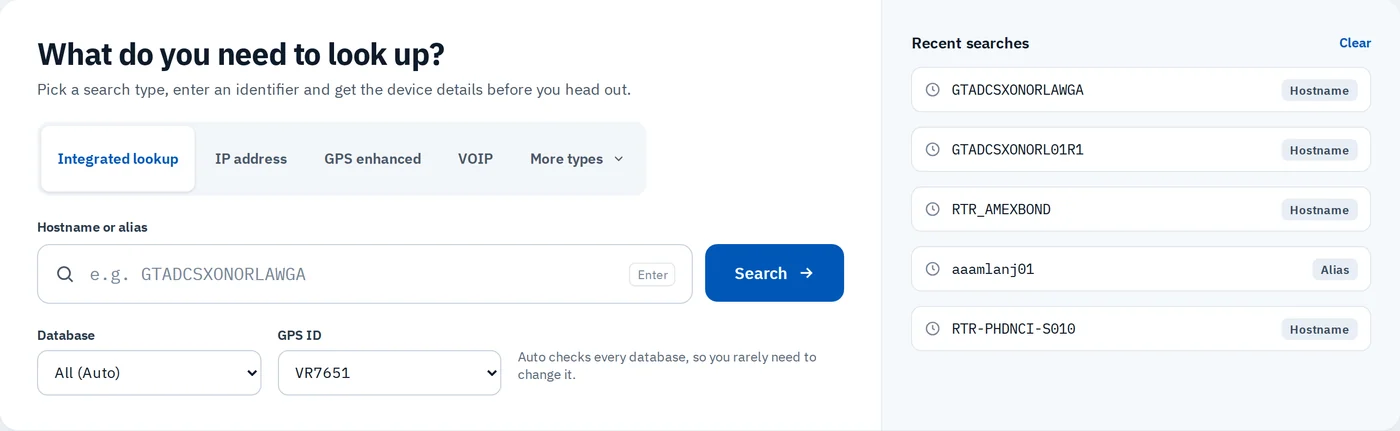

My redesign
The redesigned flow, from the first search to saving an asset's details before the engineer heads out.
One question up top, recent searches beside it, and customer reports that explain how to unlock them.
Assets in a clean table with status pills, the selected asset's details beside it, and one button to save them for the site visit. Empty columns are hidden, not shown blank.
Twelve loose fields regrouped into Location, Customer & site, and Asset & network. All ten search types sit in a side list instead of a hidden dropdown.
Visual system
What do you need to look up?
Chosen for its clarity at small sizes in dense tables.
GTADCSXONORL01R1
A fixed-width face keeps 0/O and 1/l apart in hostnames and serials.
Outcome
Every search type is visible and one click away, instead of hidden in a dropdown.
One accent colour, grouped reports and hidden empty columns cut the visual noise.
Results can be saved for the site visit, which is what engineers need the data for.
This redesign was a short solo engagement with no formal usability testing. The next step would be to watch engineers run their usual lookups on the new screens and measure time to find a device.